Alta Badia set out to further refine its visual identity and translate it into a timeless system. As one of the most well-known destinations in the heart of the Dolomites, with strong international visibility, Alta Badia requires a presence that can remain consistent across both winter and summer.
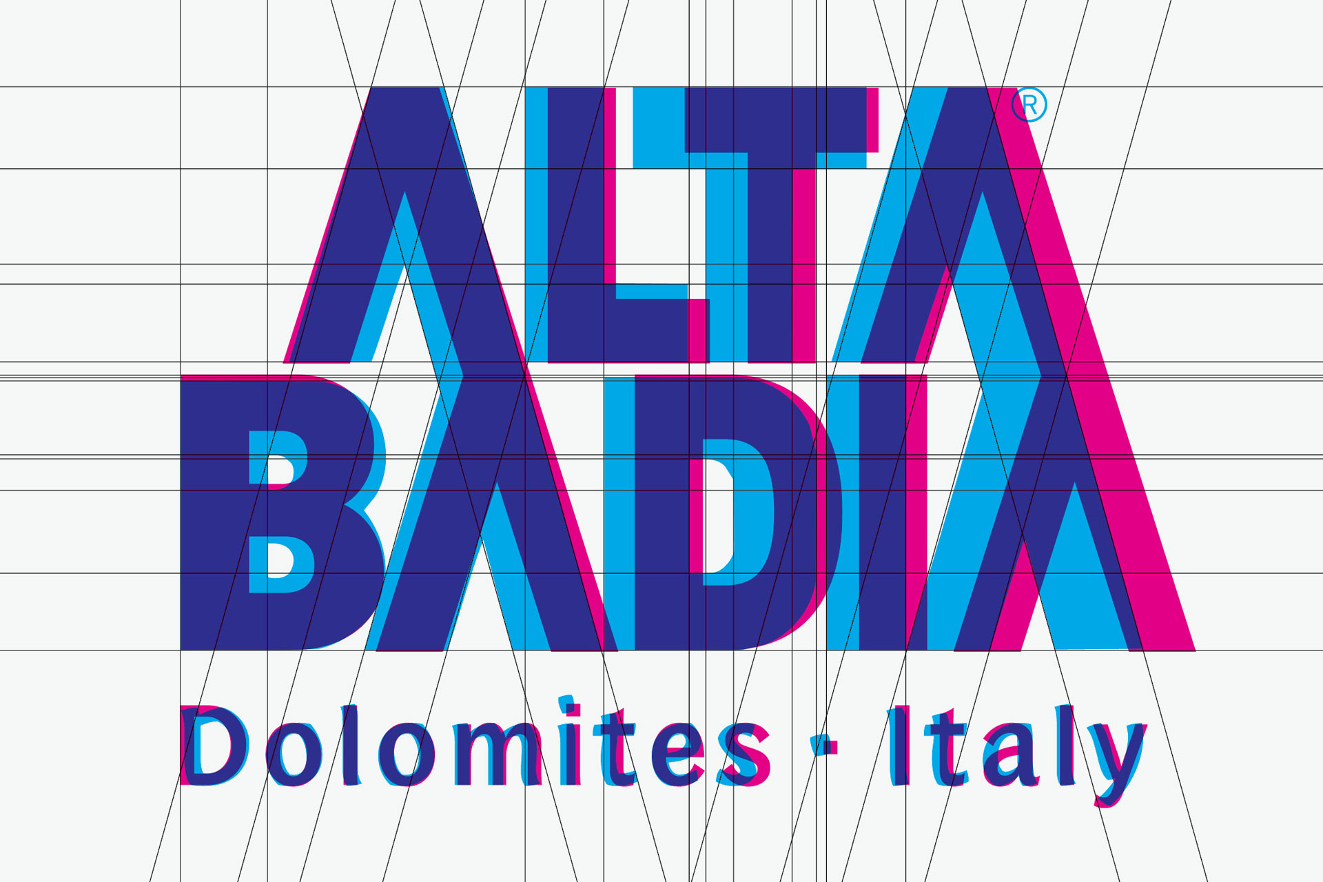
Since the 1970s, the logo has carried the signature of Arthur Zelger and with it a distinct sense of character. Over time, however, small typographic inconsistencies became visible in digital applications, from slightly shifted proportions to details that had lost their sharpness.
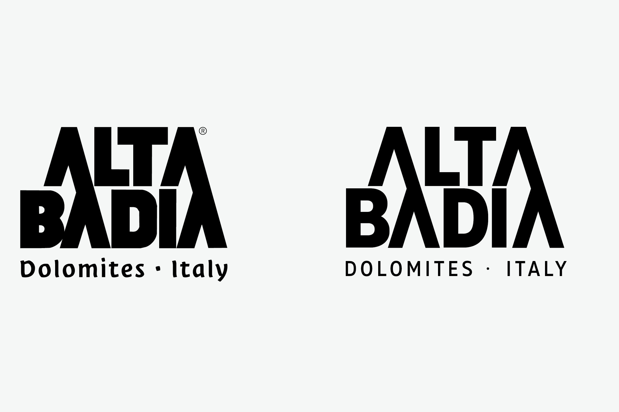
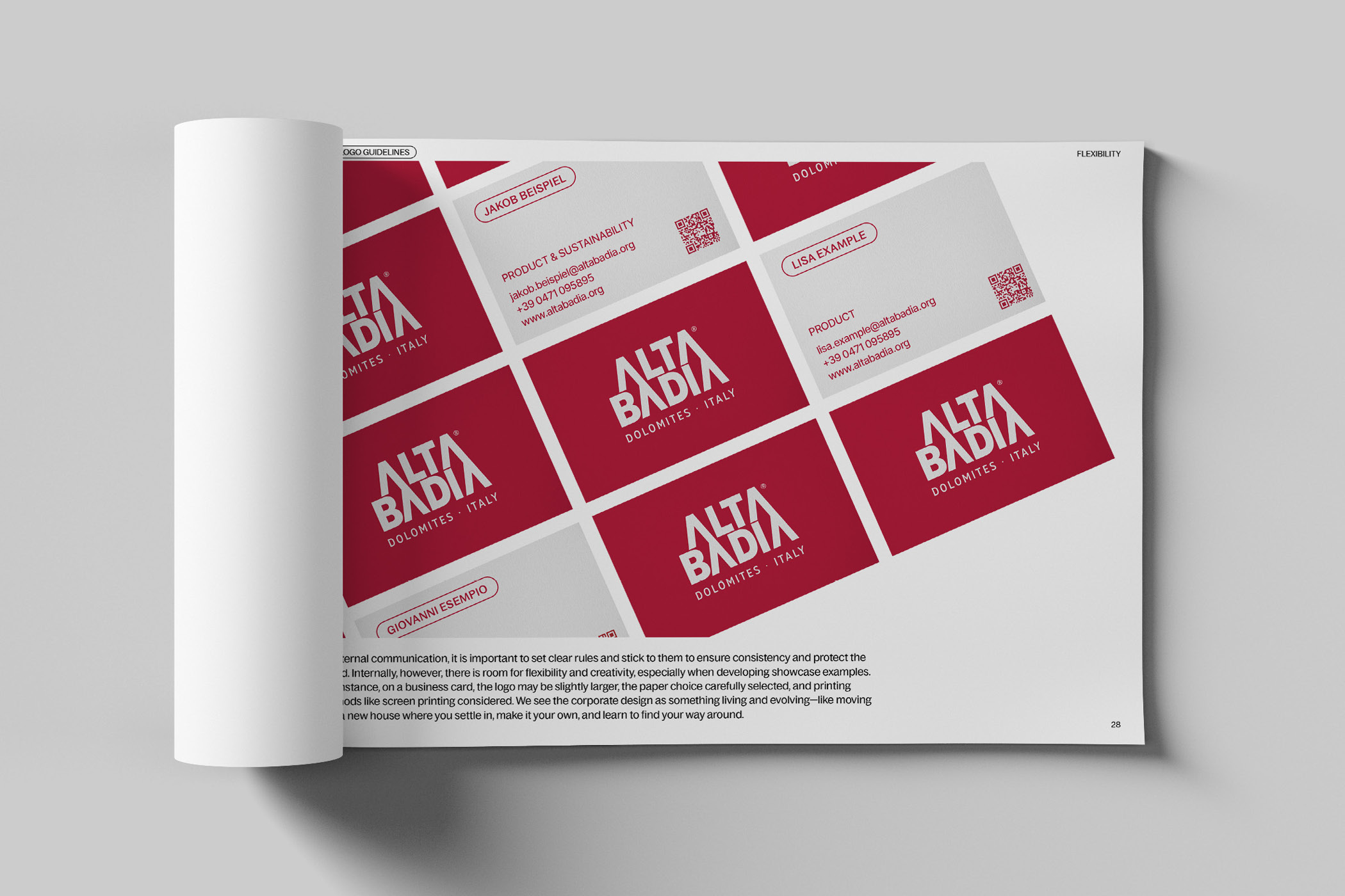
The focus was on a careful evolution that respects the origin. The overall appearance of the brand was meant to feel coherent again, without major disruption and remain consistent across all media. Typography became the central anchor, giving the corporate design rhythm and recognizability.
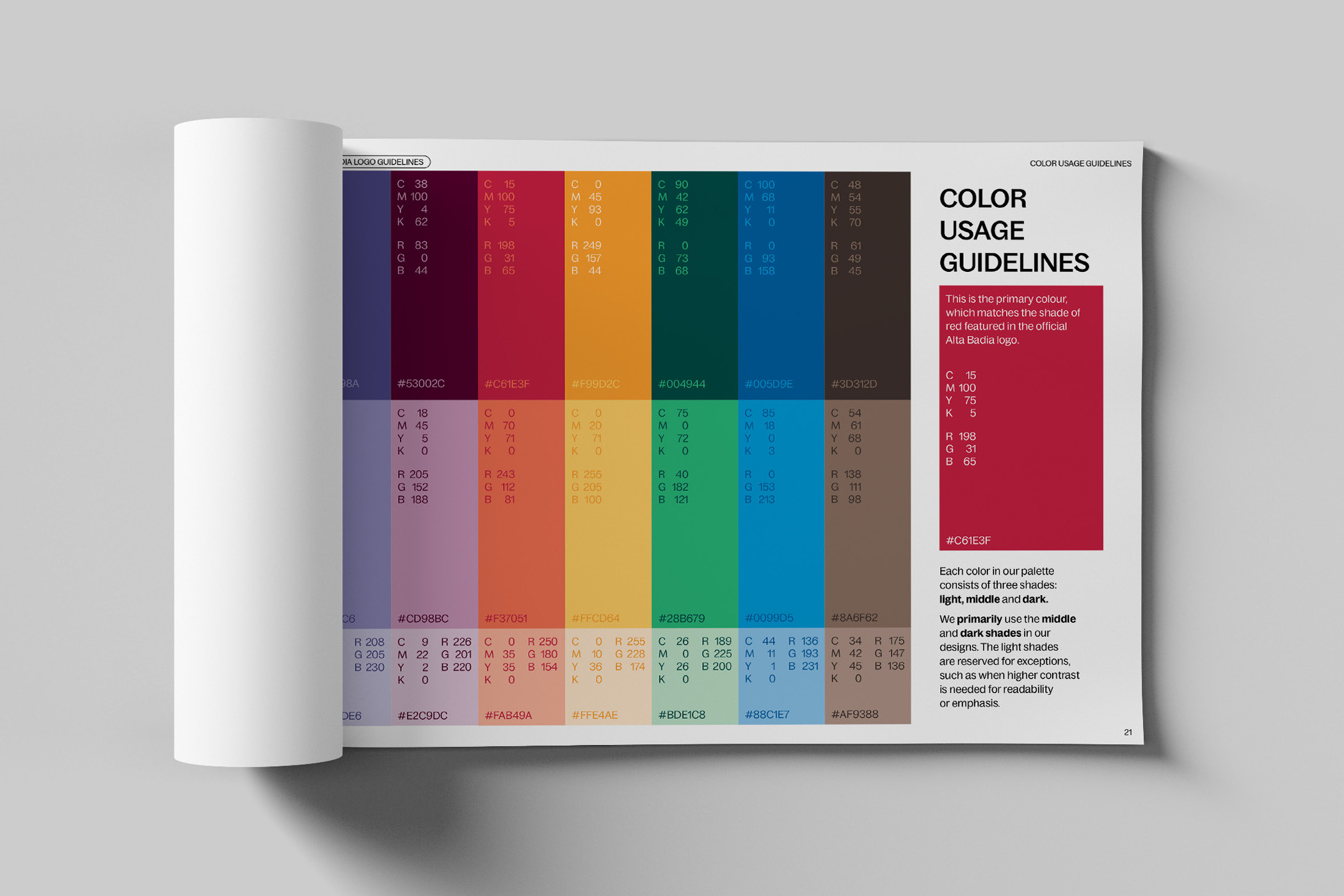
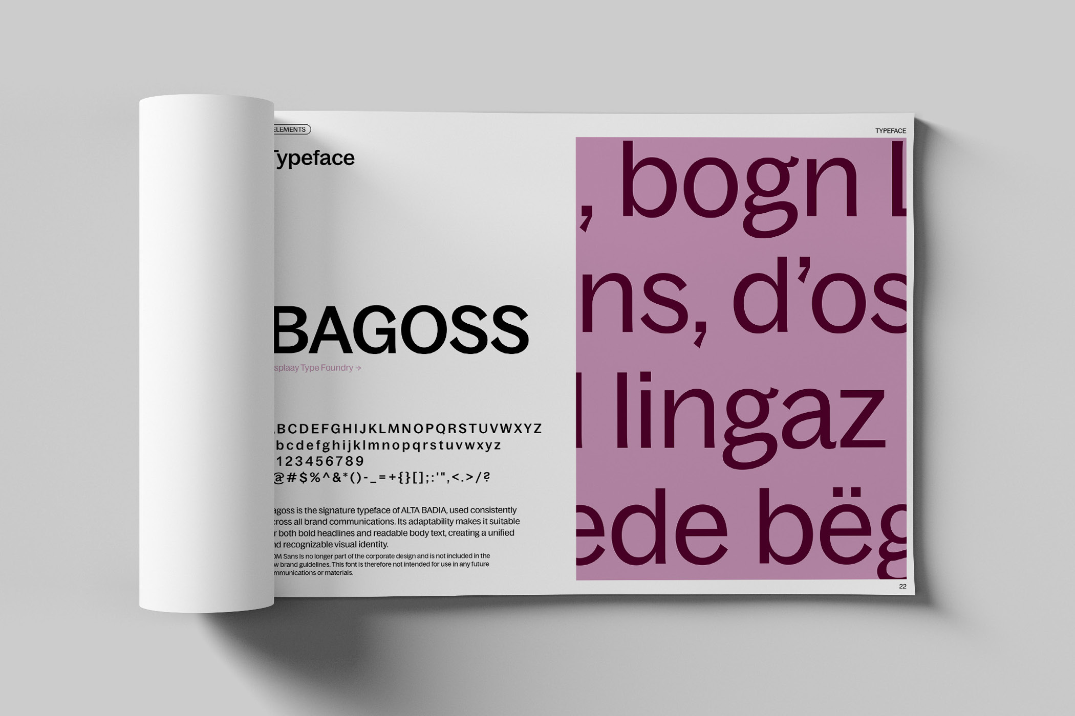
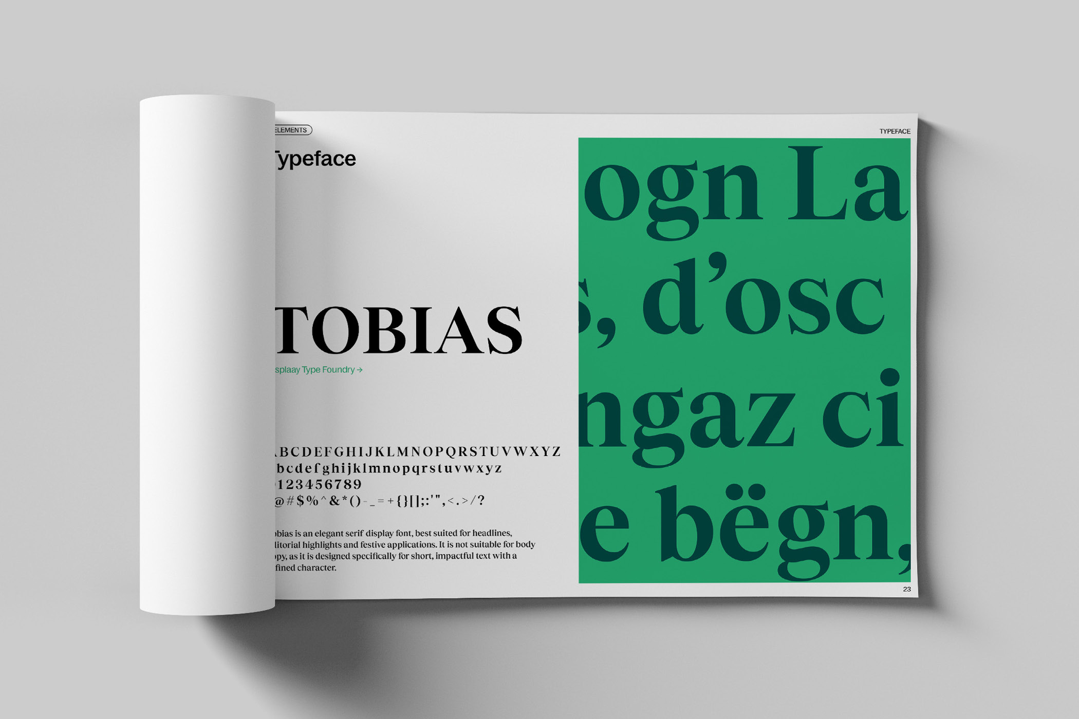
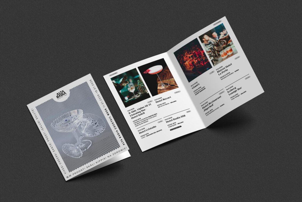
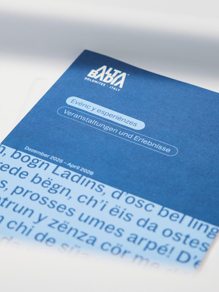
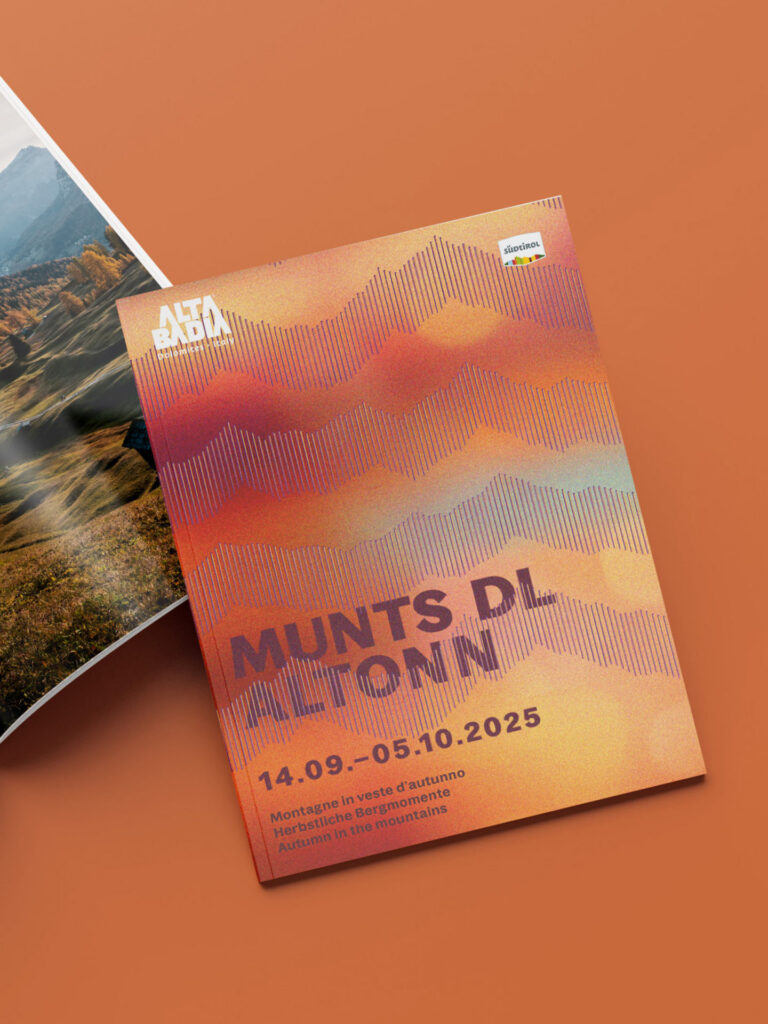
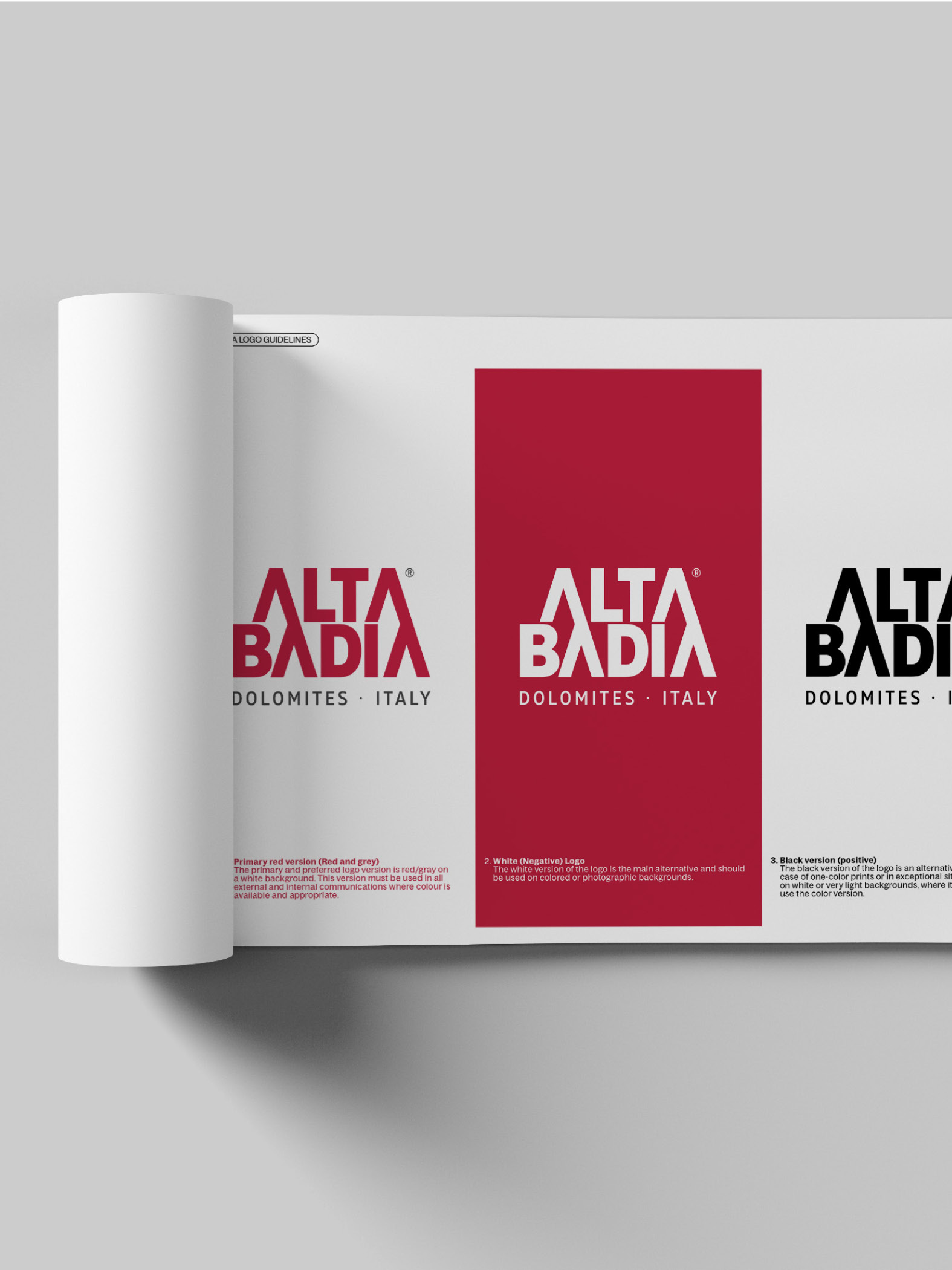
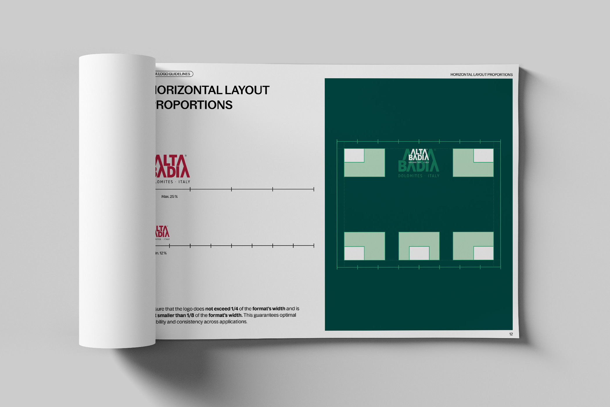
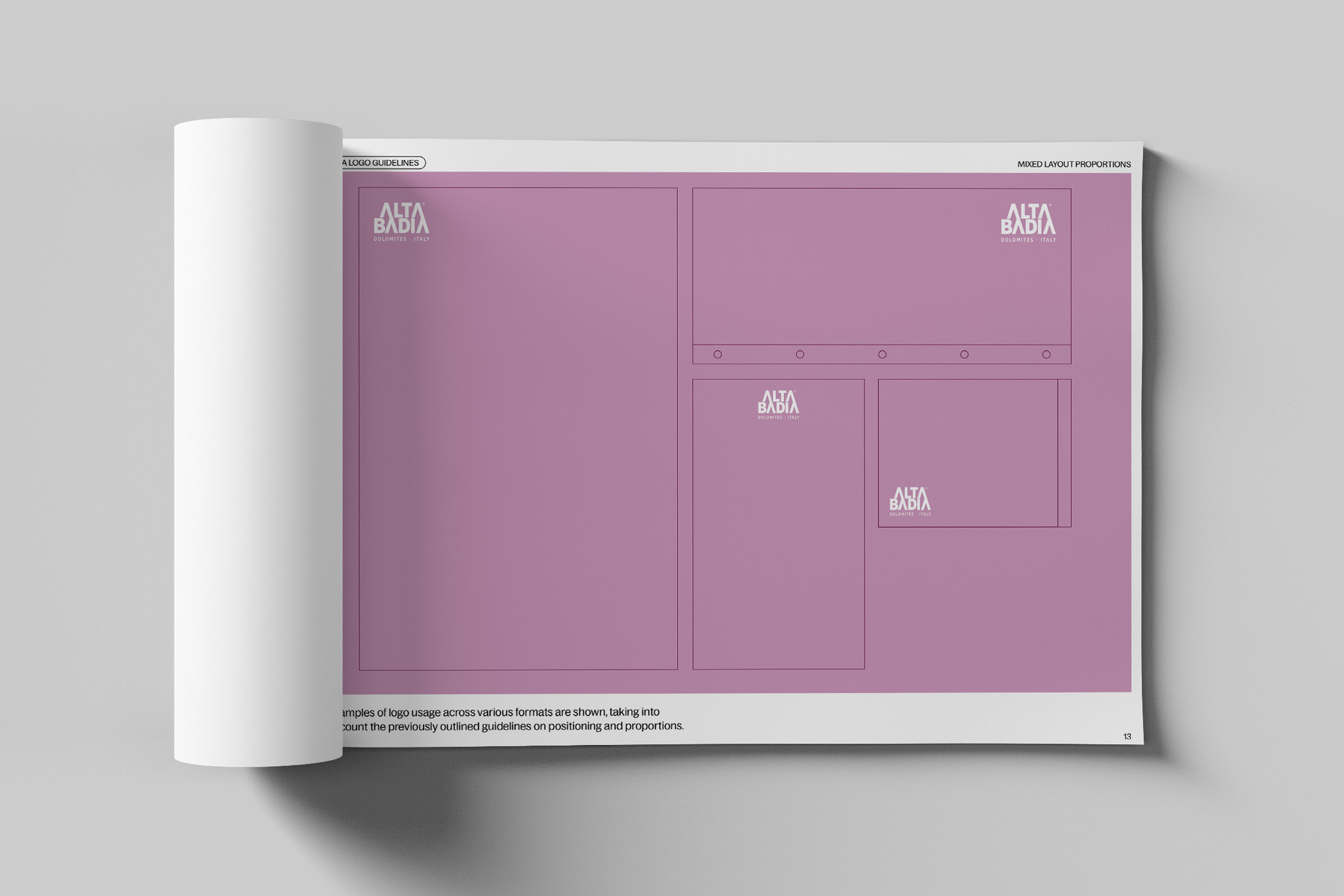
From this conceptual foundation, a comprehensive brand manual was developed, describing the system and making it applicable in practice. It covers color, typography, layout examples, imagery and tone of voice. The transition into real-world use was a coordinated rollout, where printed materials and additional media were adapted. Together with the brand office, we have been supporting this process for almost two years.