Zum Inhalt Wechseln

Museum Ladin

Over the past 25 years, Museum Ladin has carried, and gradually worn down a classic early-2000s design with great dedication. With the arrival of the new director came the desire to fundamentally update the museum’s visual identity and give the institution a form that reflects today’s approach to exhibitions, art, and Ladin culture.

Art & Culture Tourism & Hospitality Branding Communication Design Strategy & Consultation Websites
Gemäldegalerie mit Text 'Museum Ladin' über dem Bild.

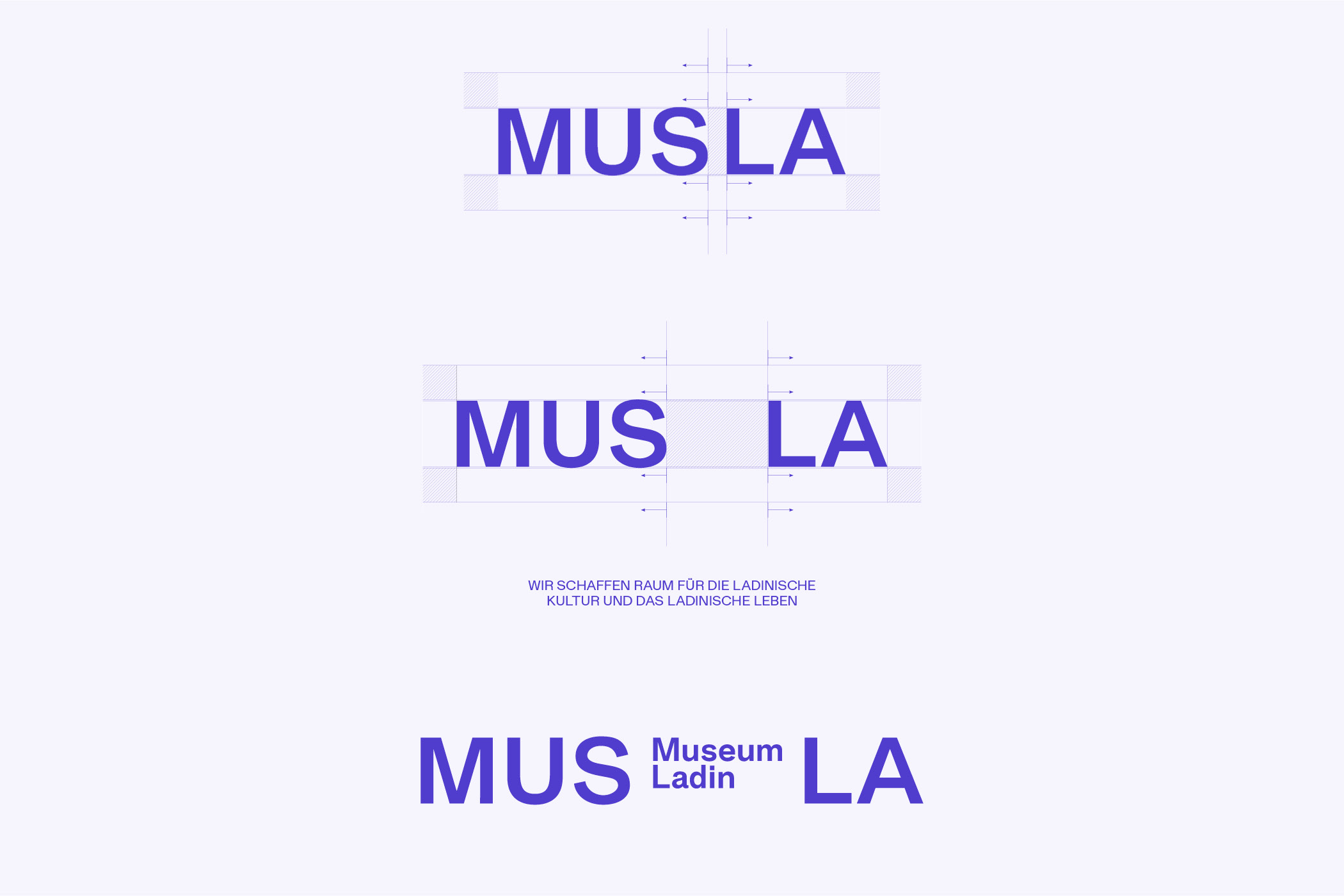
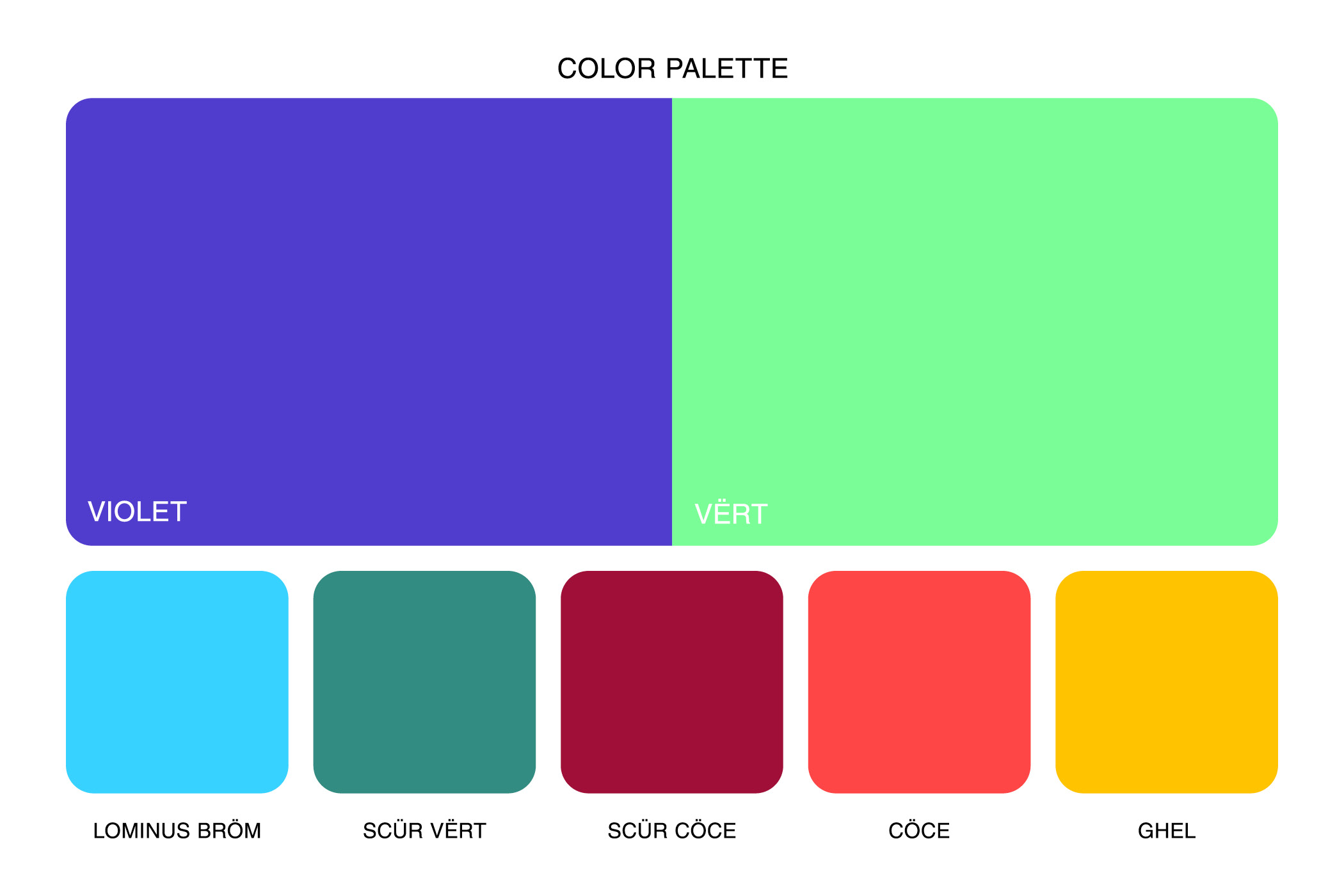
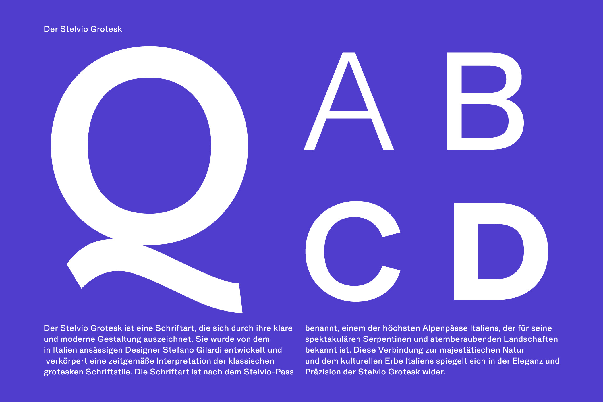
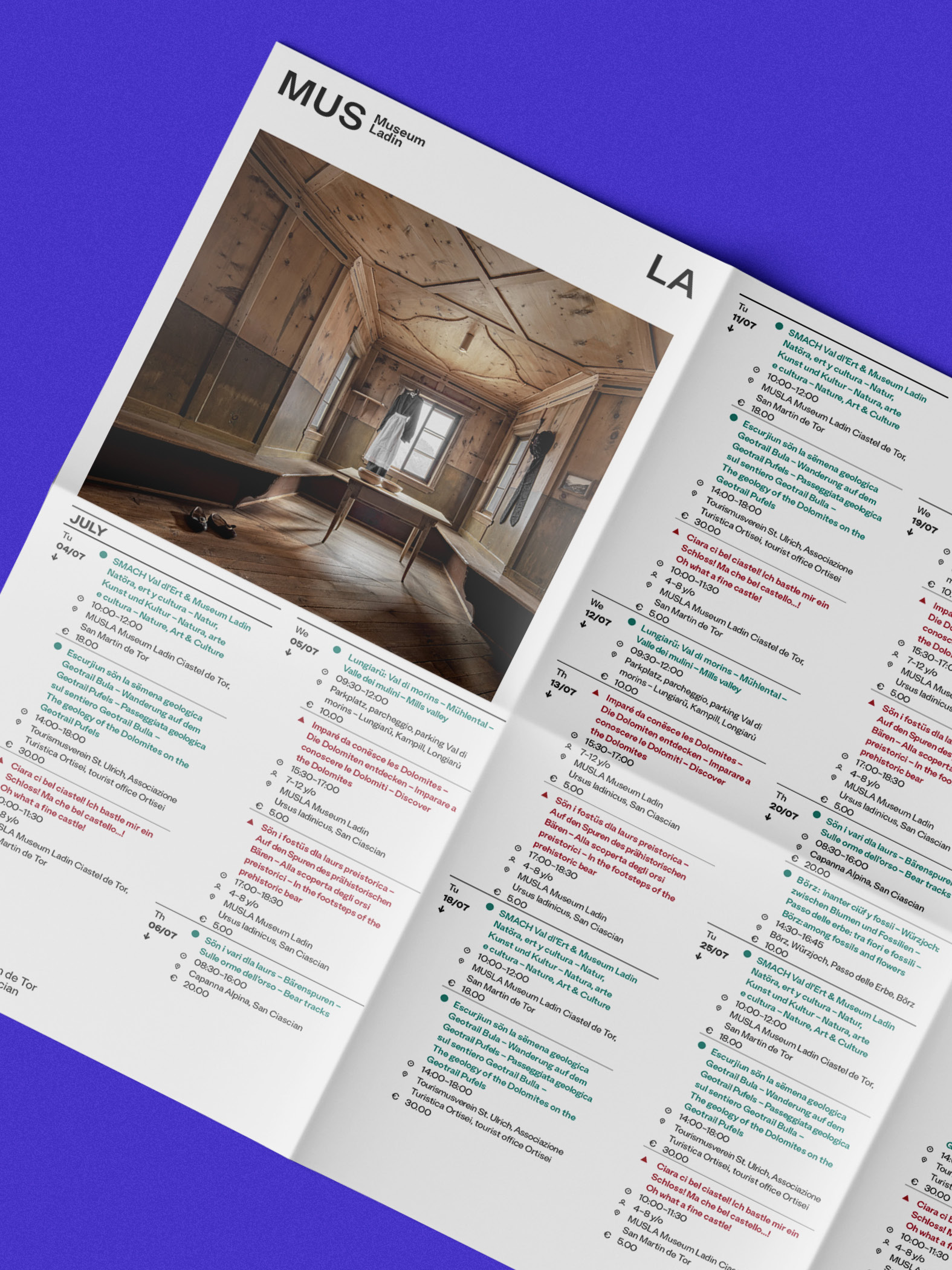
Visually, Museum Ladin was still strongly shaped by its own history, while at the same time having reached a point where the design language of the 2000s could no longer keep up with its conceptual development. The lowercase typography had lost its sense of contemporaneity, the division across two locations introduced ambiguity into the brand, and the visual framework no longer matched what the museum had already become in content.

Logoentwurf für Museum Ladin, blau auf weißem Hintergrund

After some initial, more cautious attempts, the desire for a more radical shift became clear. From both a strategic and conceptual perspective, we proposed the name MUS LA together with Michael Moling from Studio Puls. The new name was intended to still reference Museum Ladin, while opening up a broader and more flexible frame.

Farbpalette mit Blau, Grün, Rot und Gelb.
Große Buchstaben Q, A, B, C, D auf violettem Hintergrund
Kalenderbroschüre des Museums Ladin mit Innenraumfoto auf violettem Hintergrund
Tablet zeigt Website des Ursus Ladinicus Museums

The logo idea emerged from two directions. On one hand, there was the need to continue communicating Museum Ladin alongside the new name. On the other, there was a strong conceptual idea: Museum Ladin, MUS LA, creates space for the full spectrum of Ladin culture in between. This led to the development of a flexible typographic logo that can be filled and shaped with imagery. Within it, Ladin culture is given the space it rightfully claims for itself.

Further typographic considerations in this direction also shaped the current typeface. The base colors are derived from the Ladin flag and are complemented by contrasting tones drawn from nature. The visual language is contemporary, presenting objects from the museum against monochrome backgrounds, resulting in a communication that is diverse, vibrant, and at the same time calm.

Webseiten-Layout von MUS LA mit Museumsinformationen
Schwebende farbige Karten, MUS Museum Laon Text sichtbar.
Kunstvolle Broschüre Museum Ladin 2023 auf violettem Hintergrund
Mehrfarbige Tassen mit Museum Ladin Schriftzug vor dunklem Hintergrund
Kontakt SAY HELLO