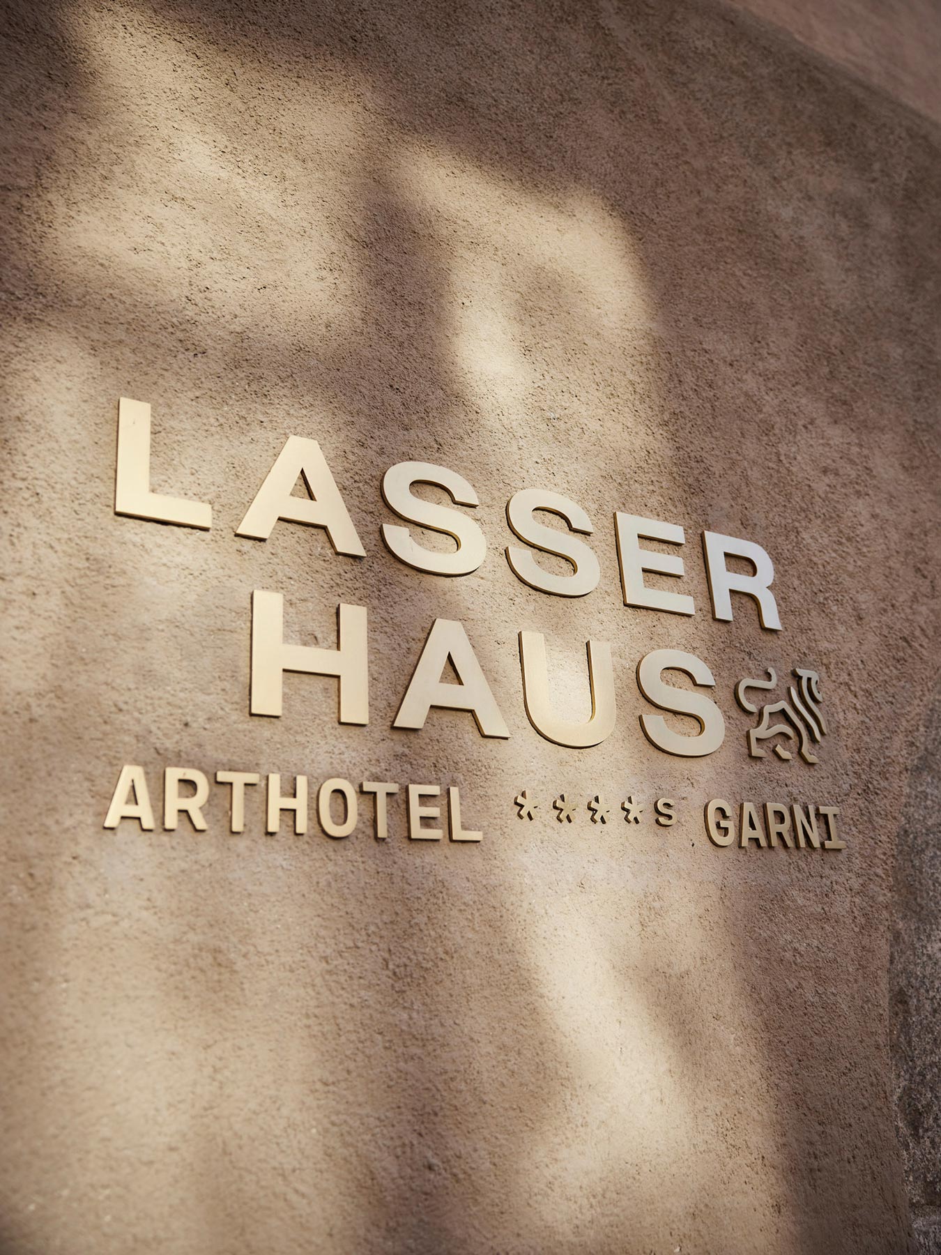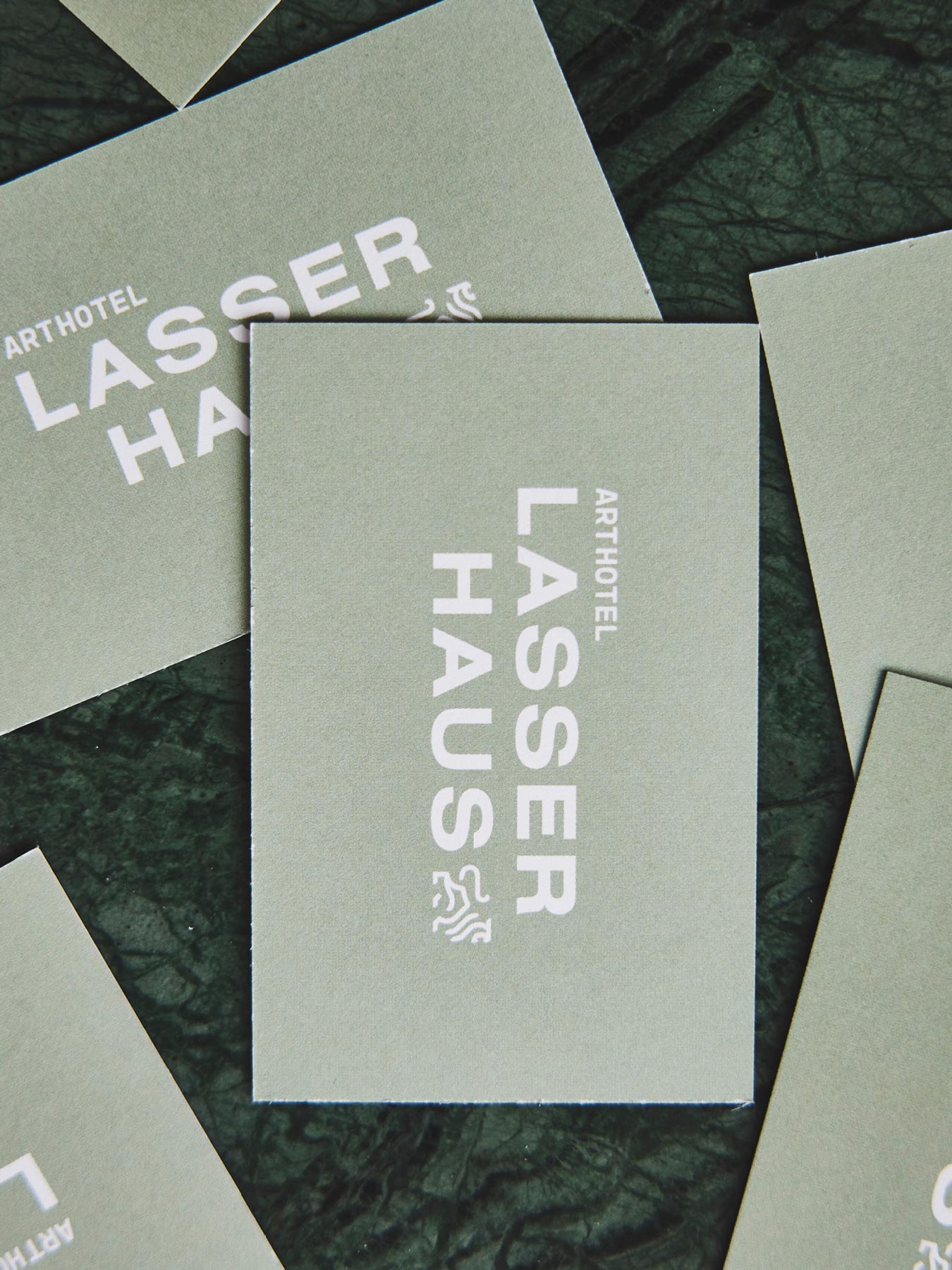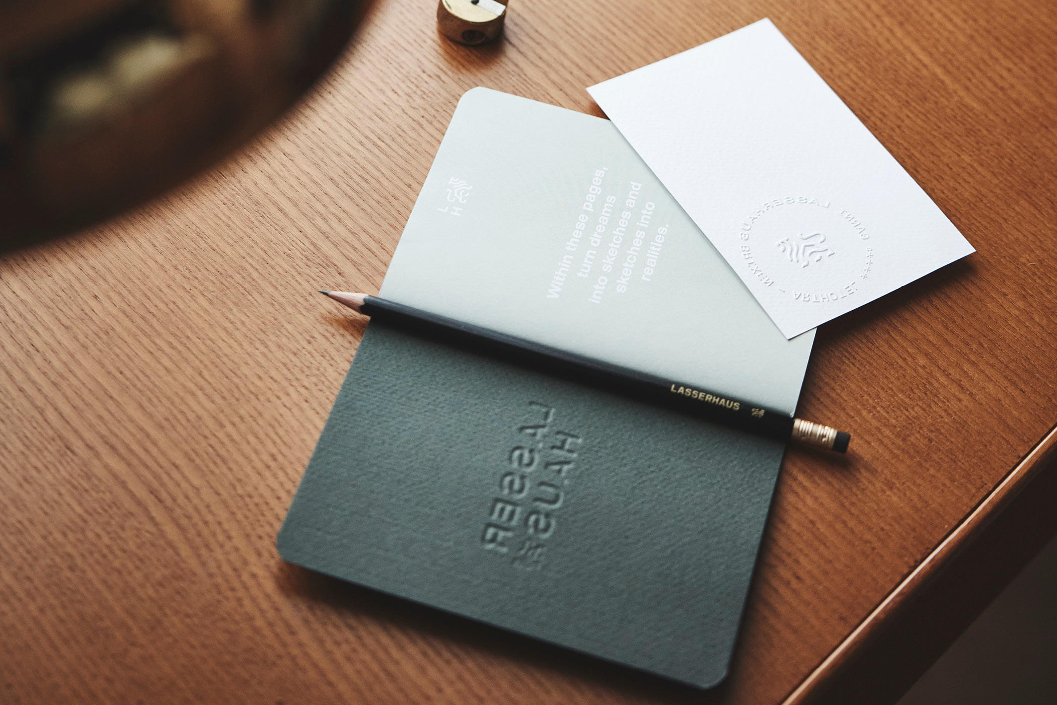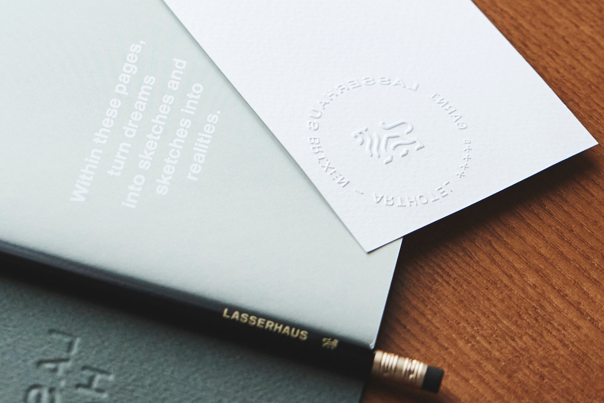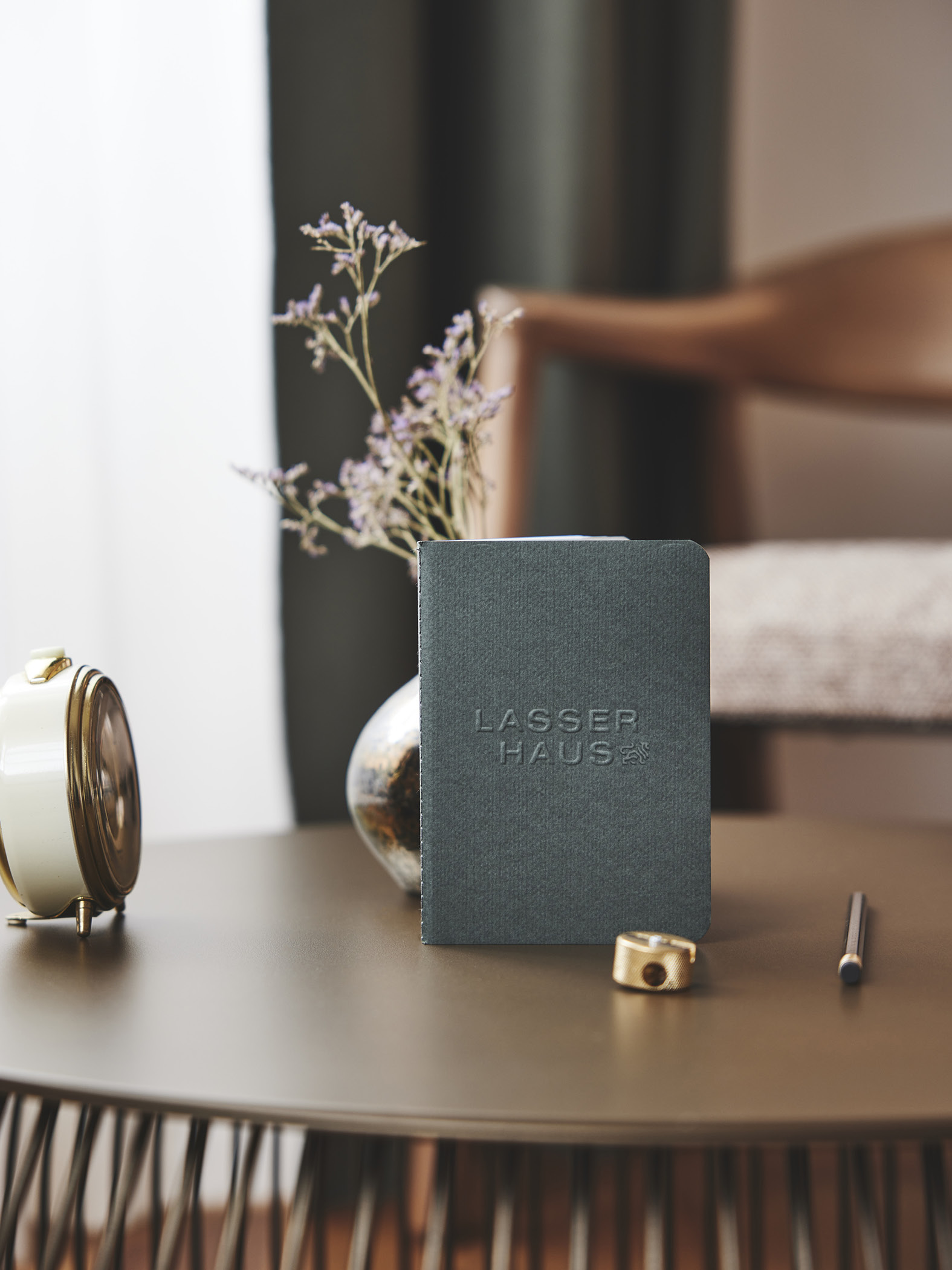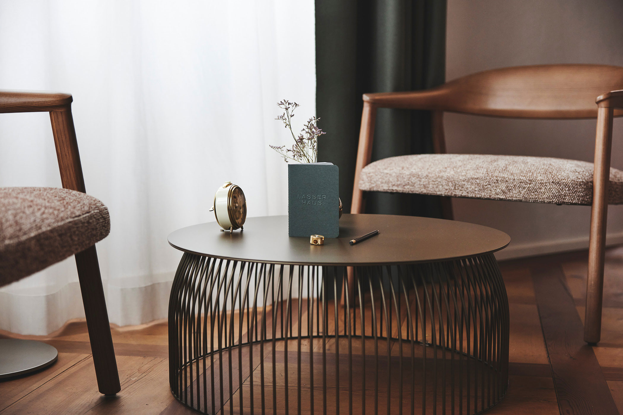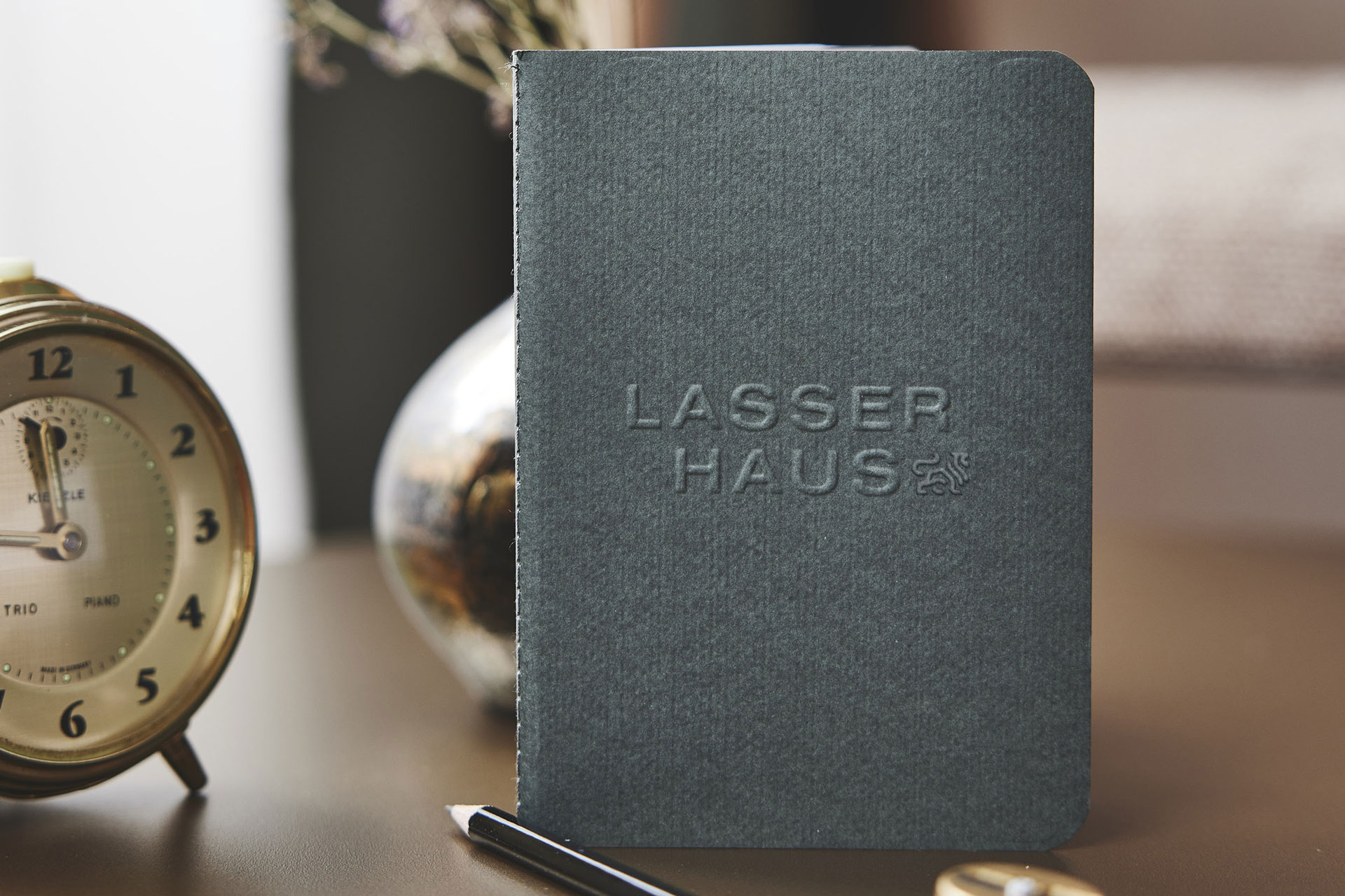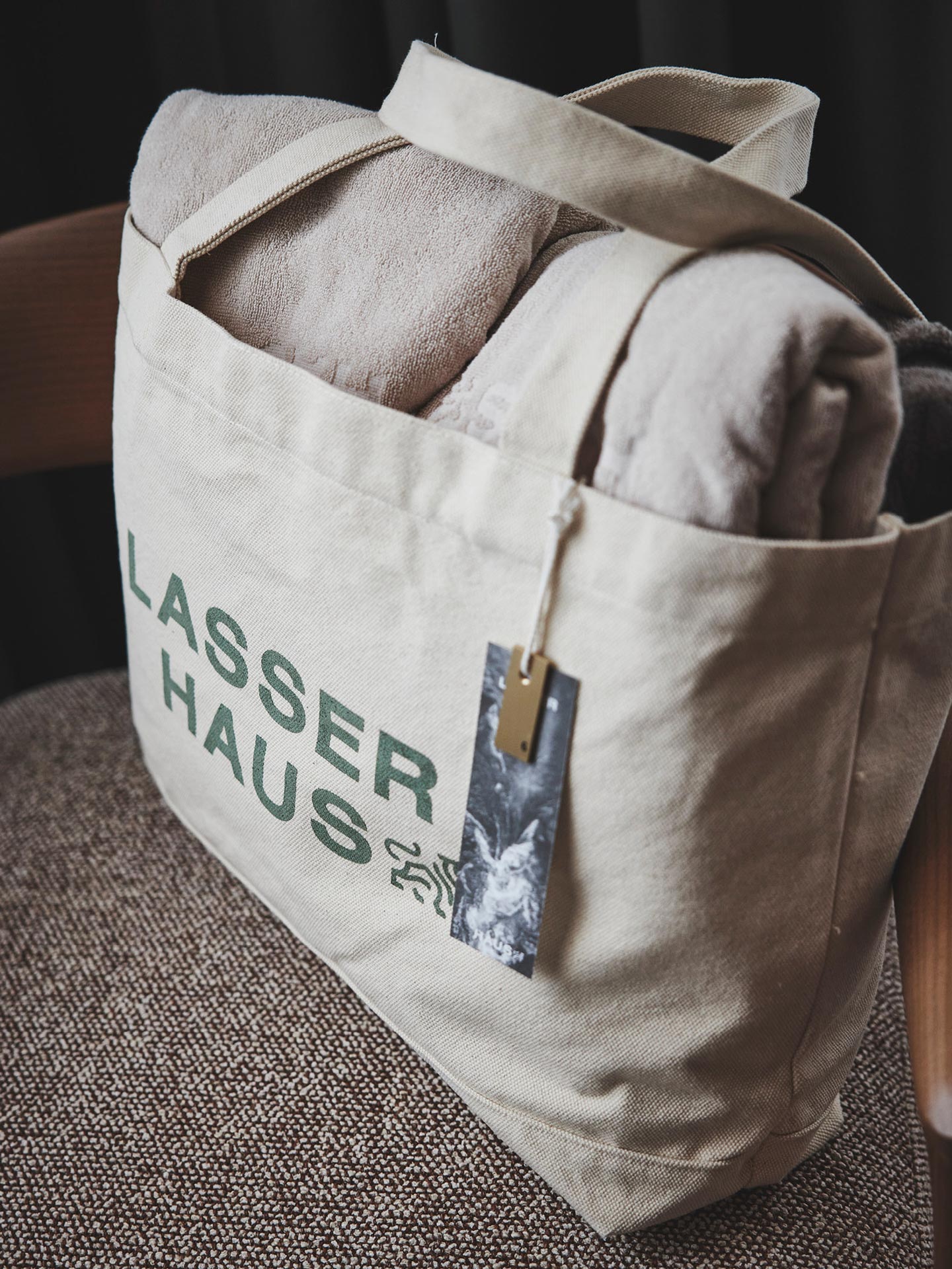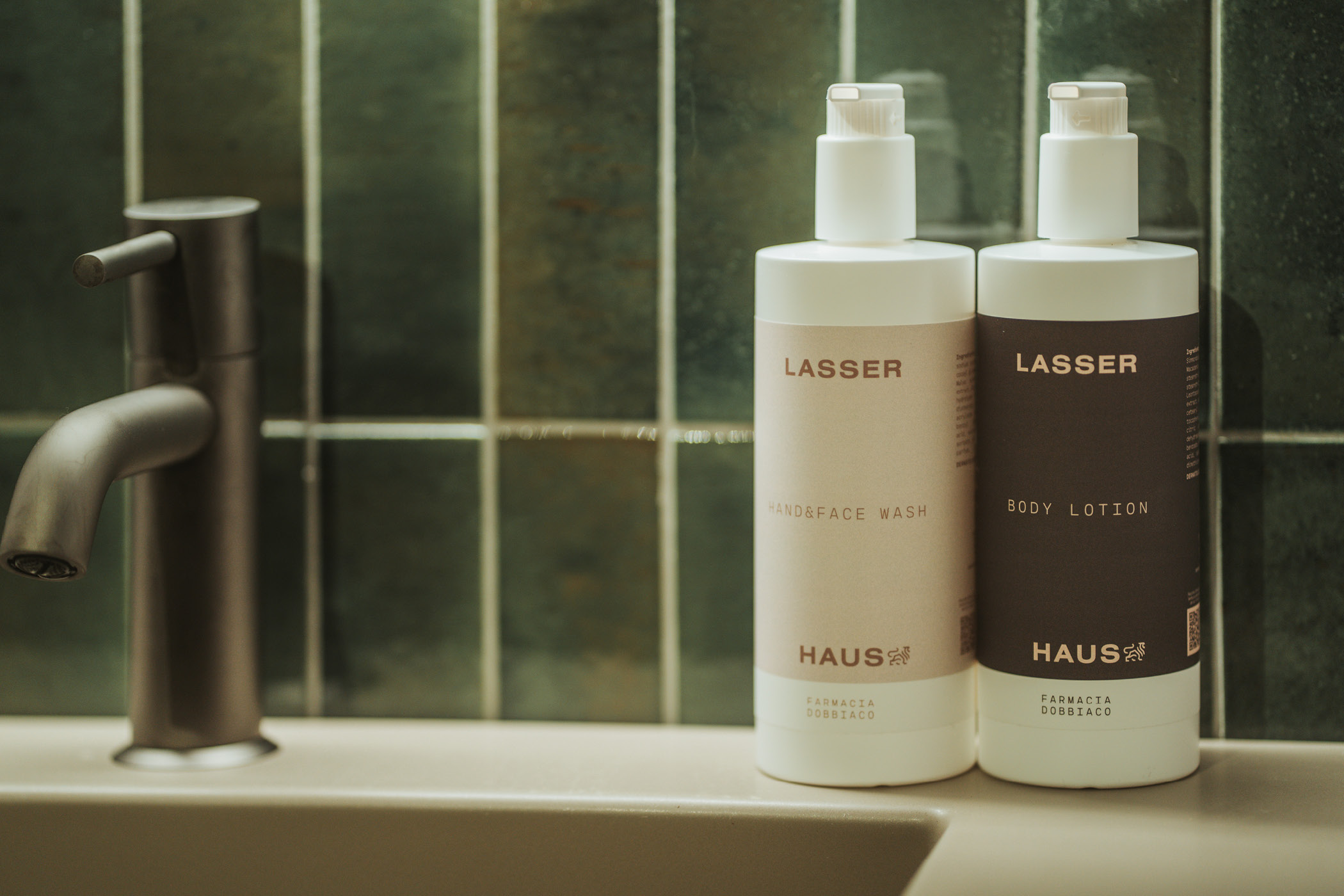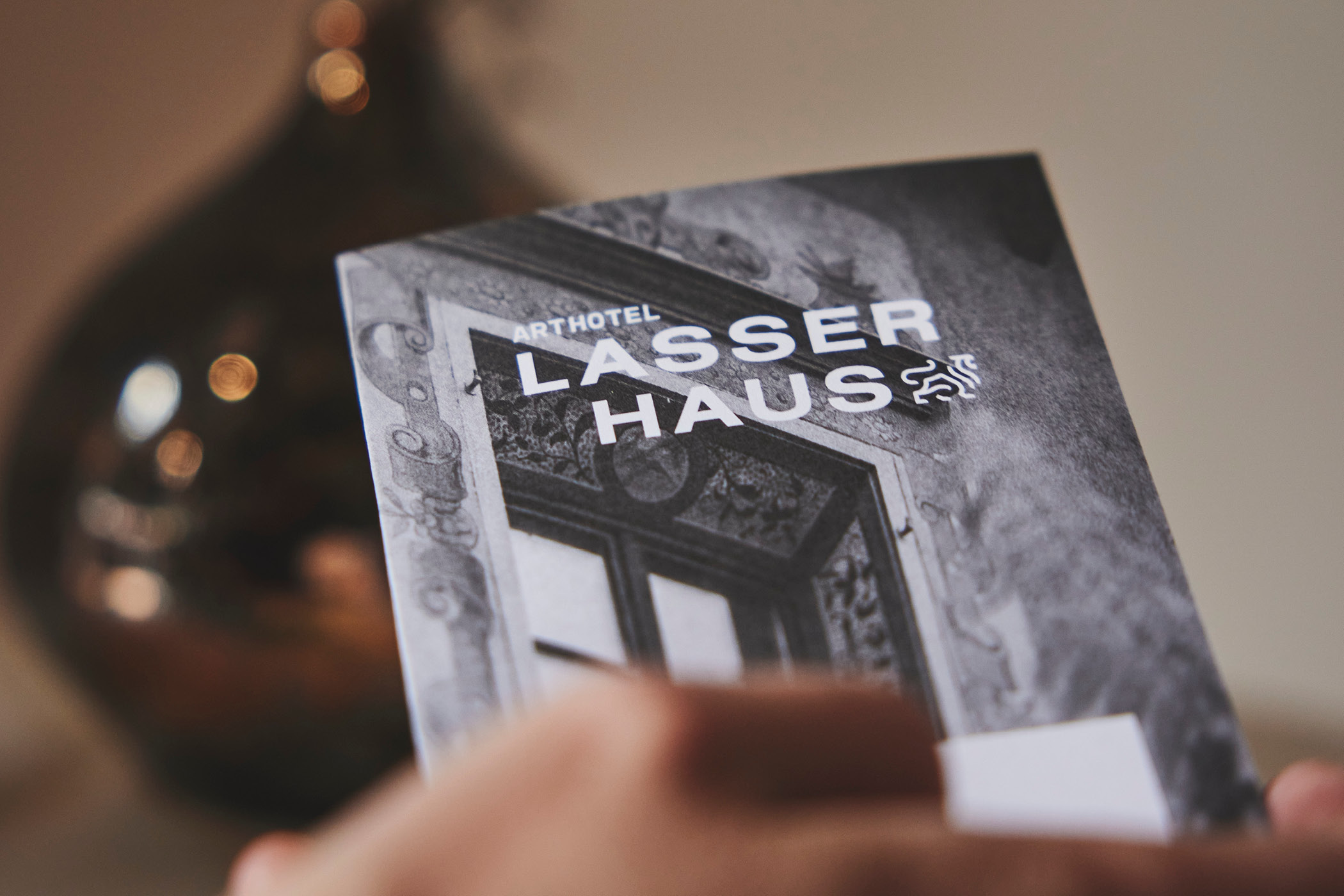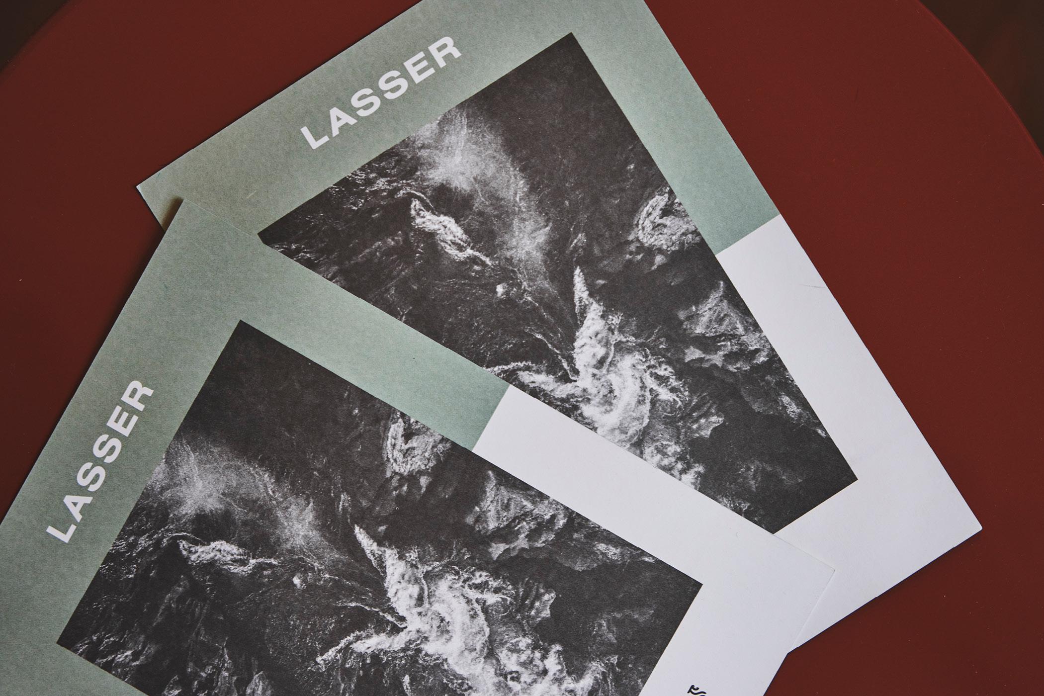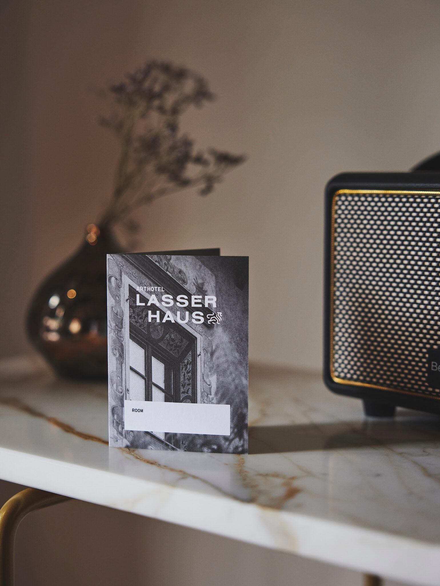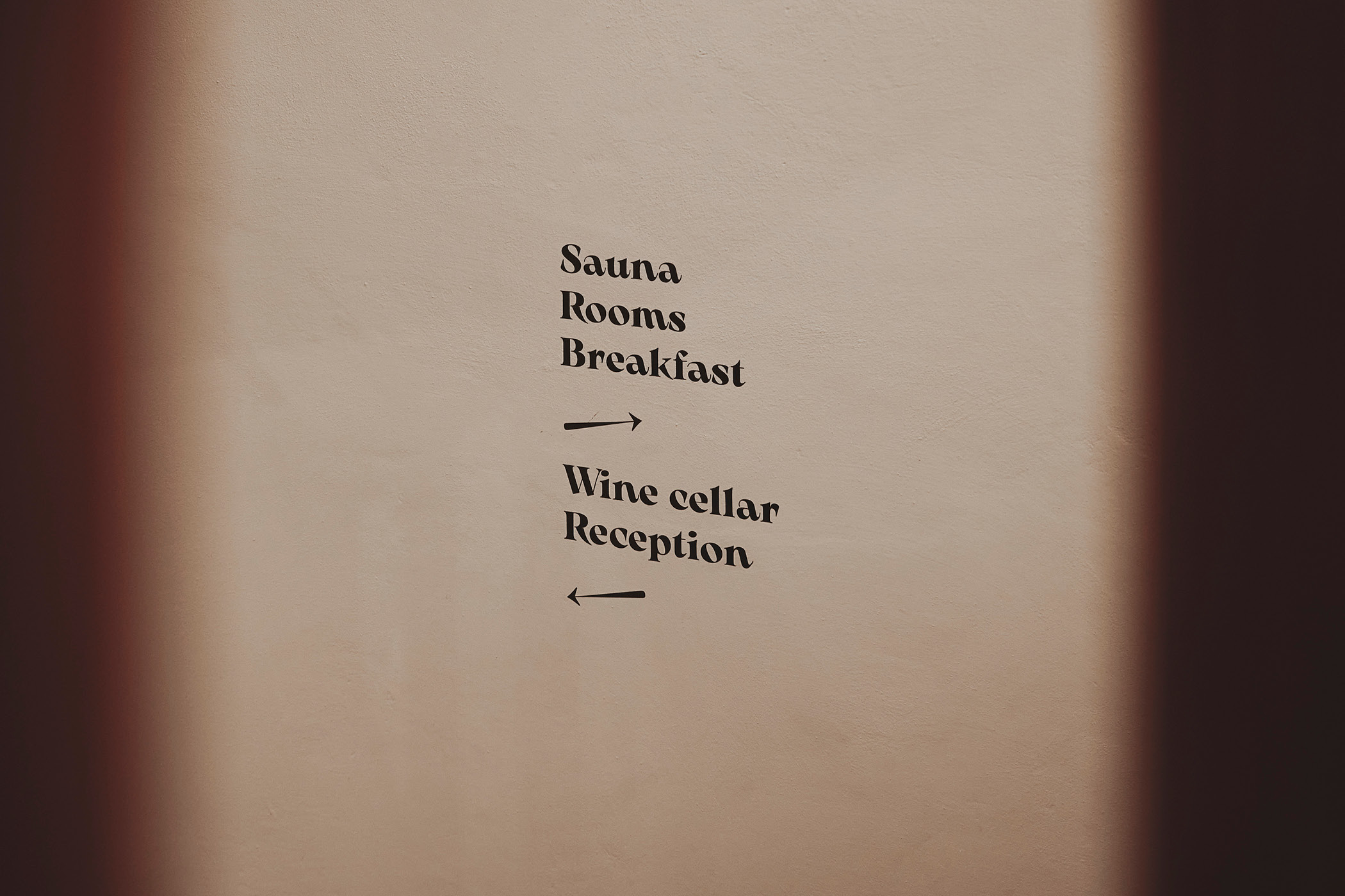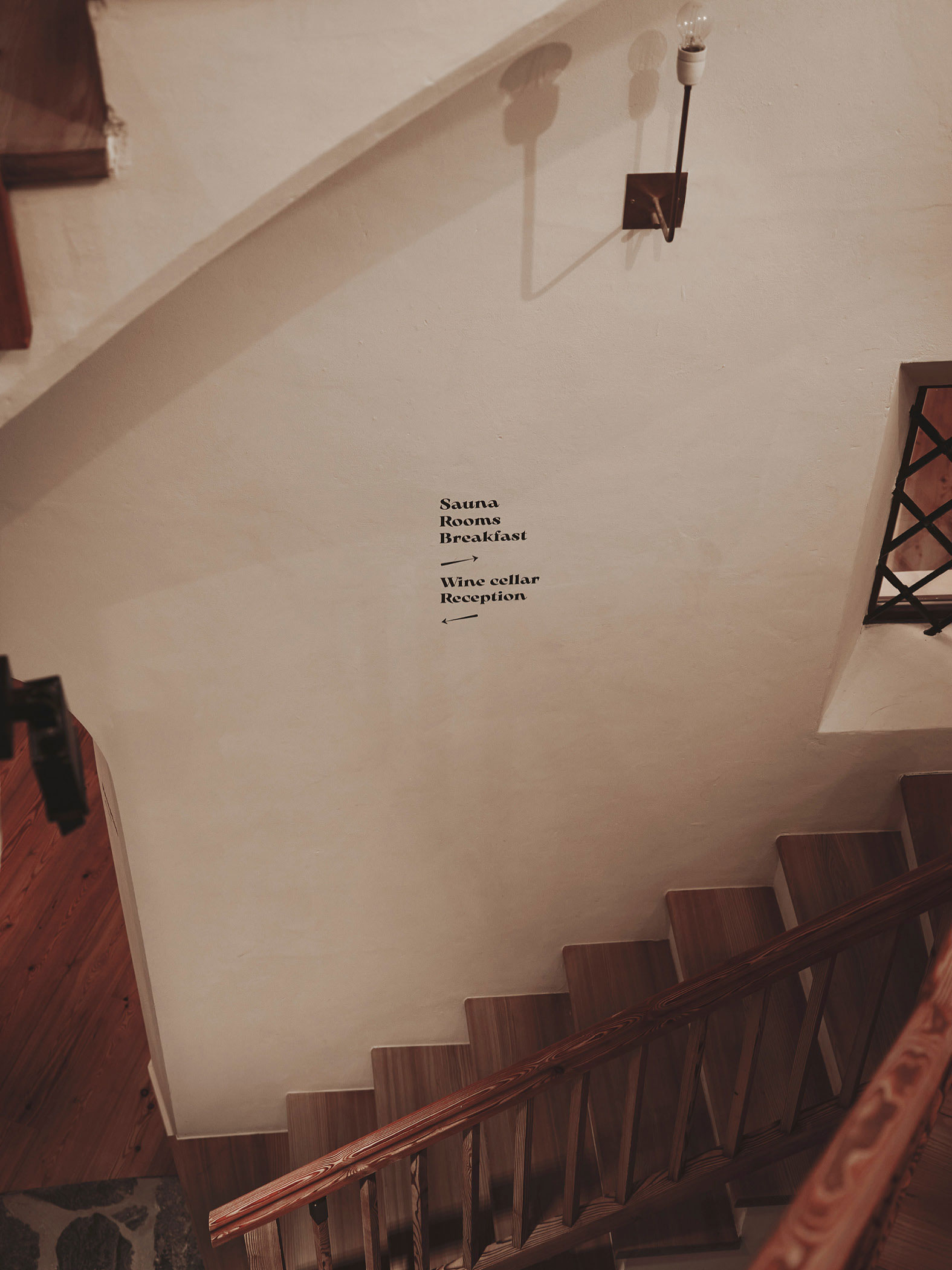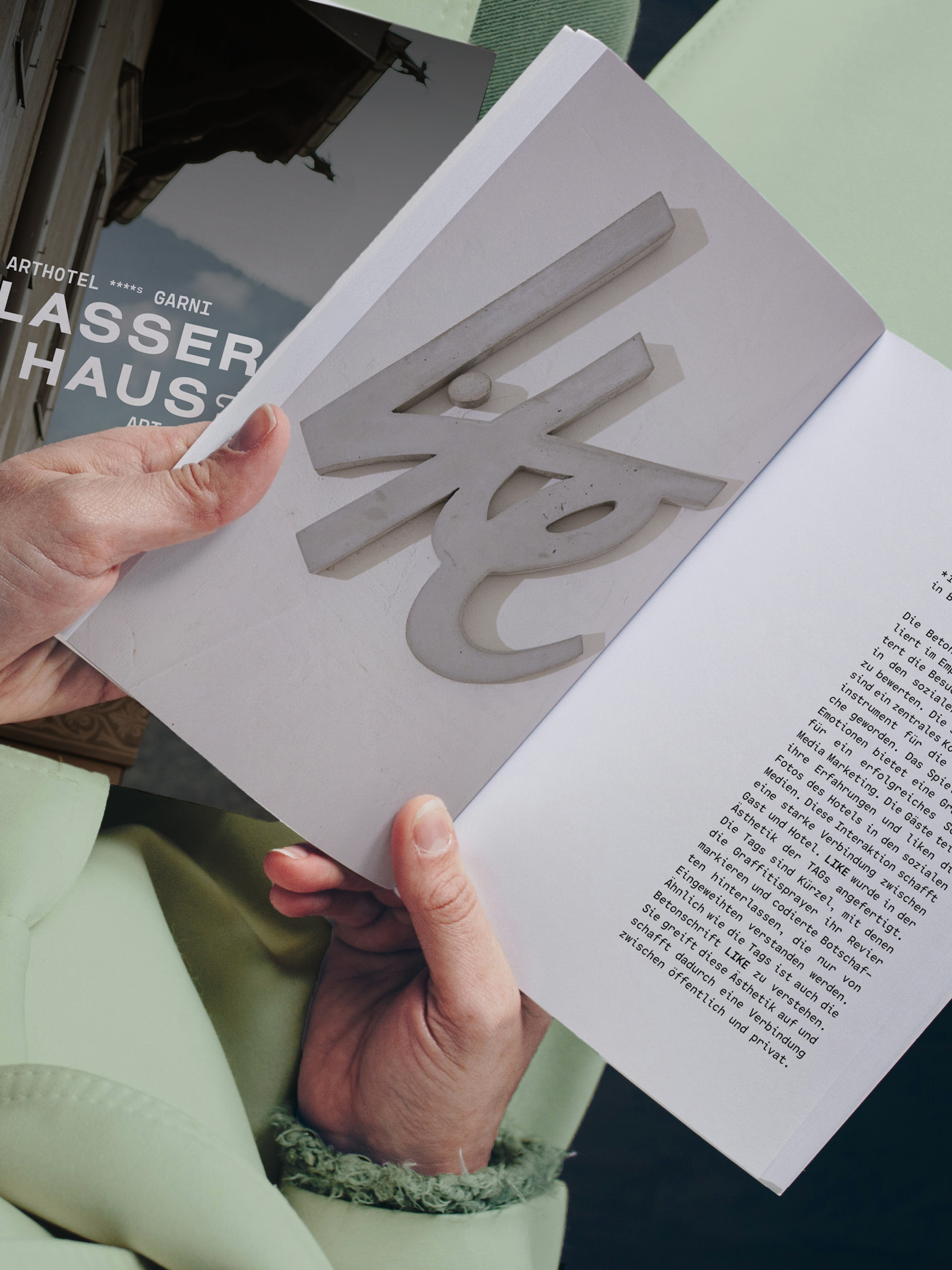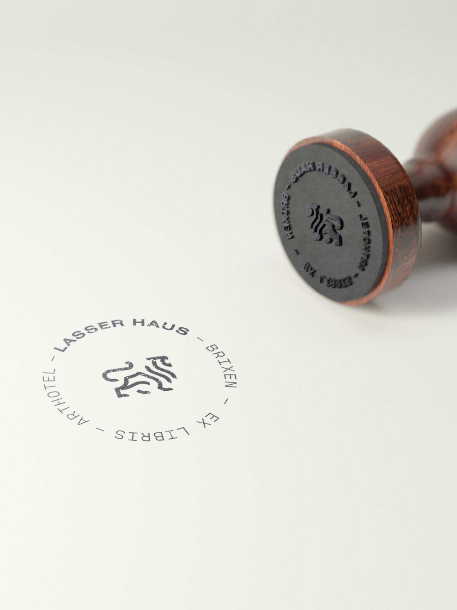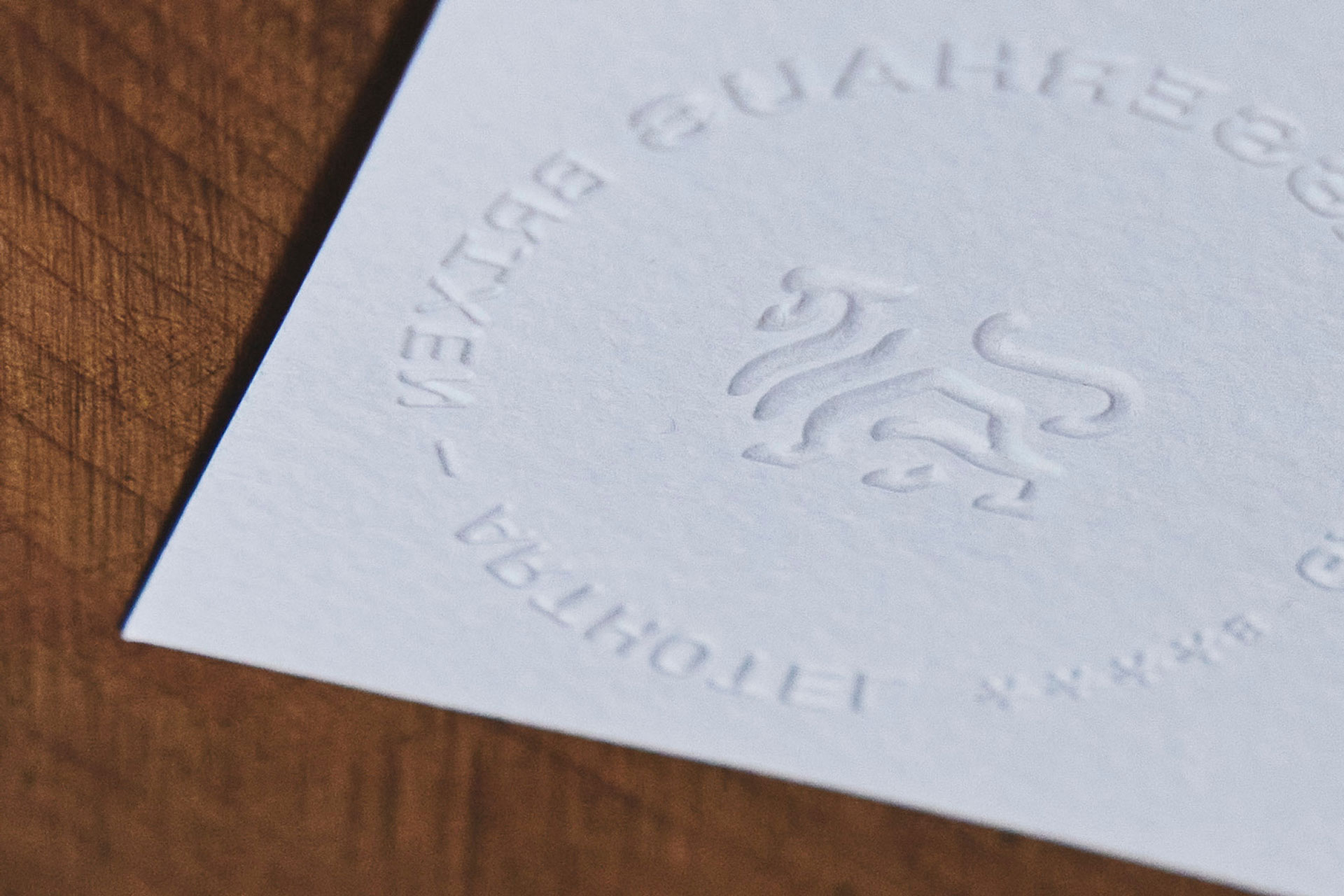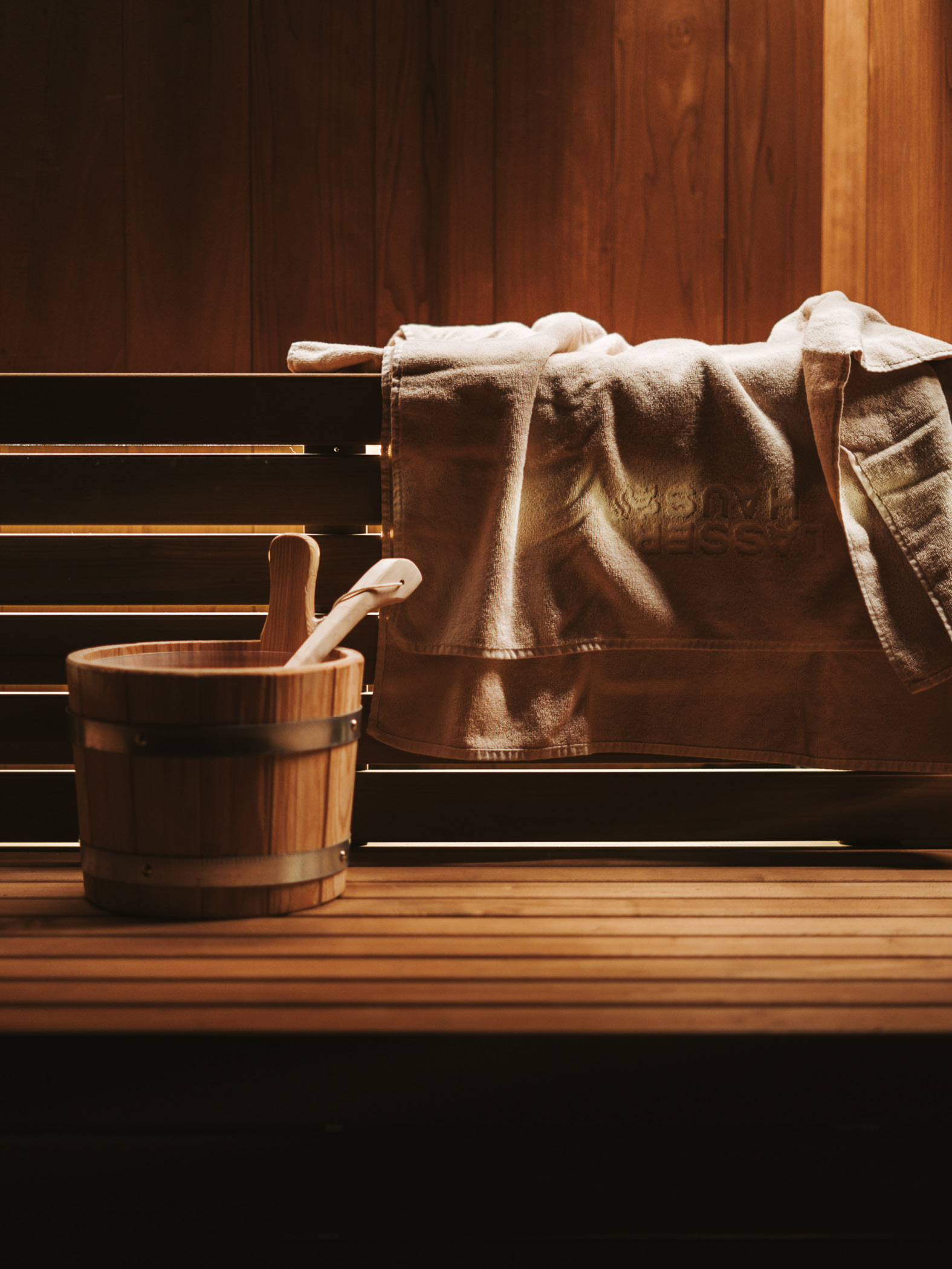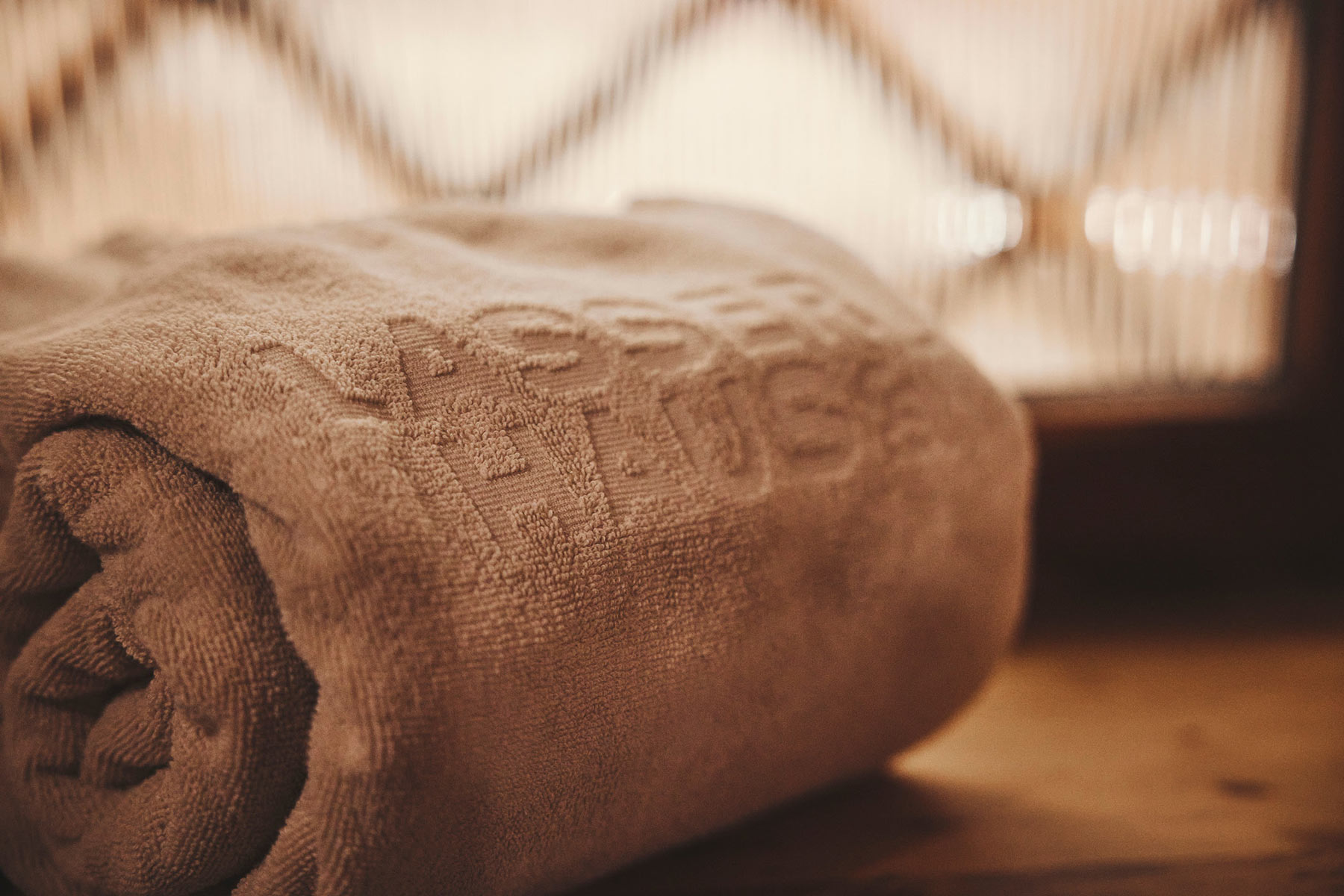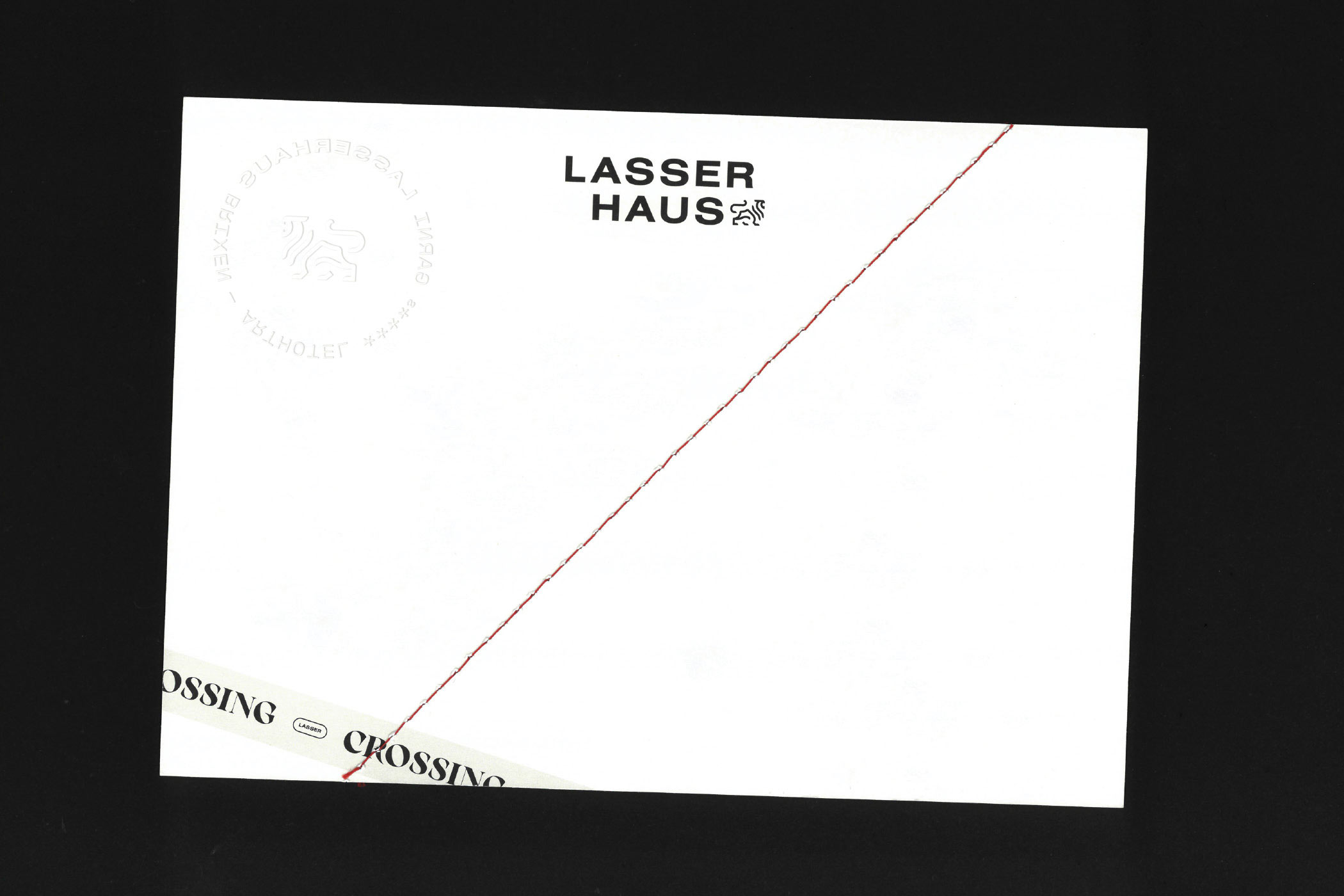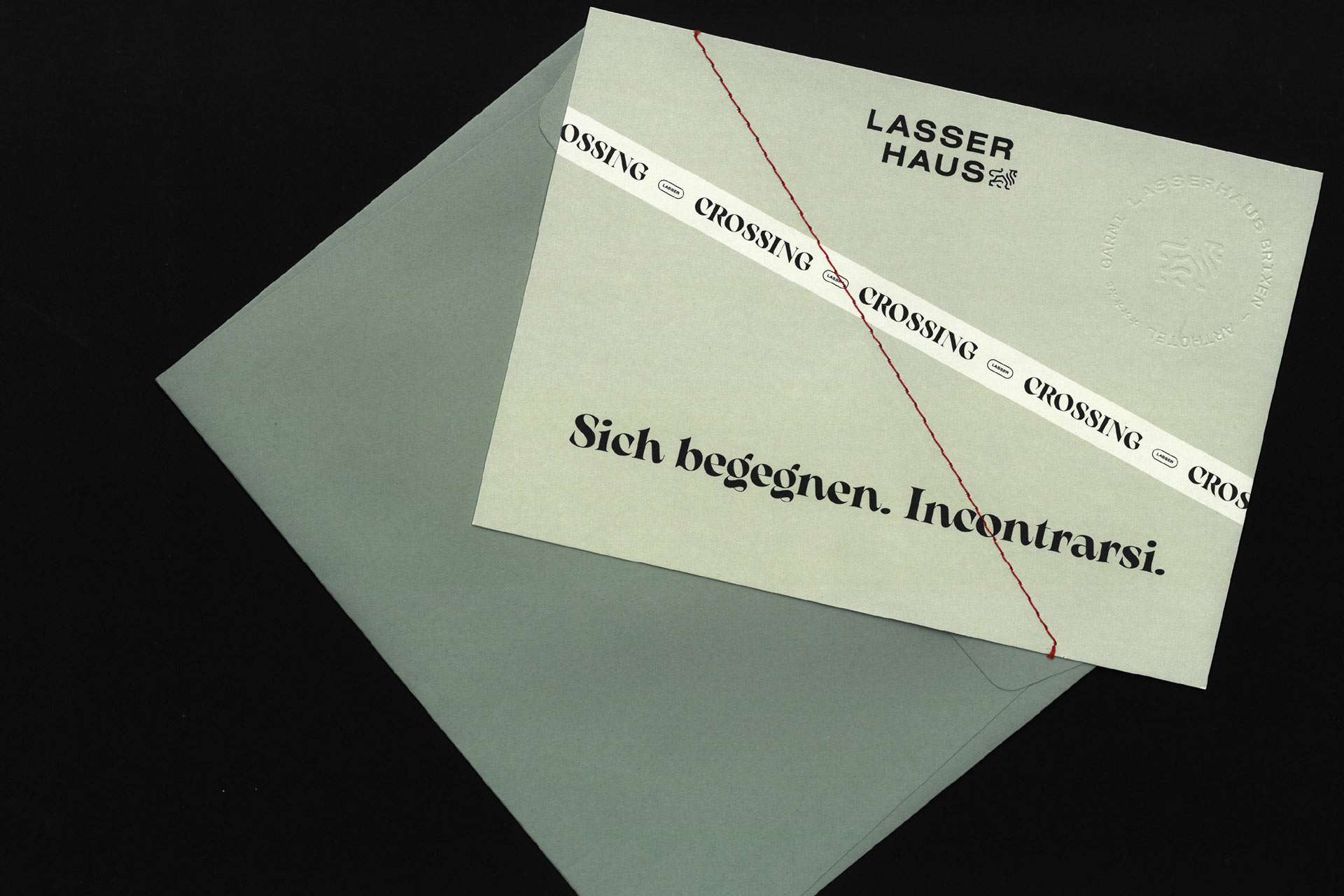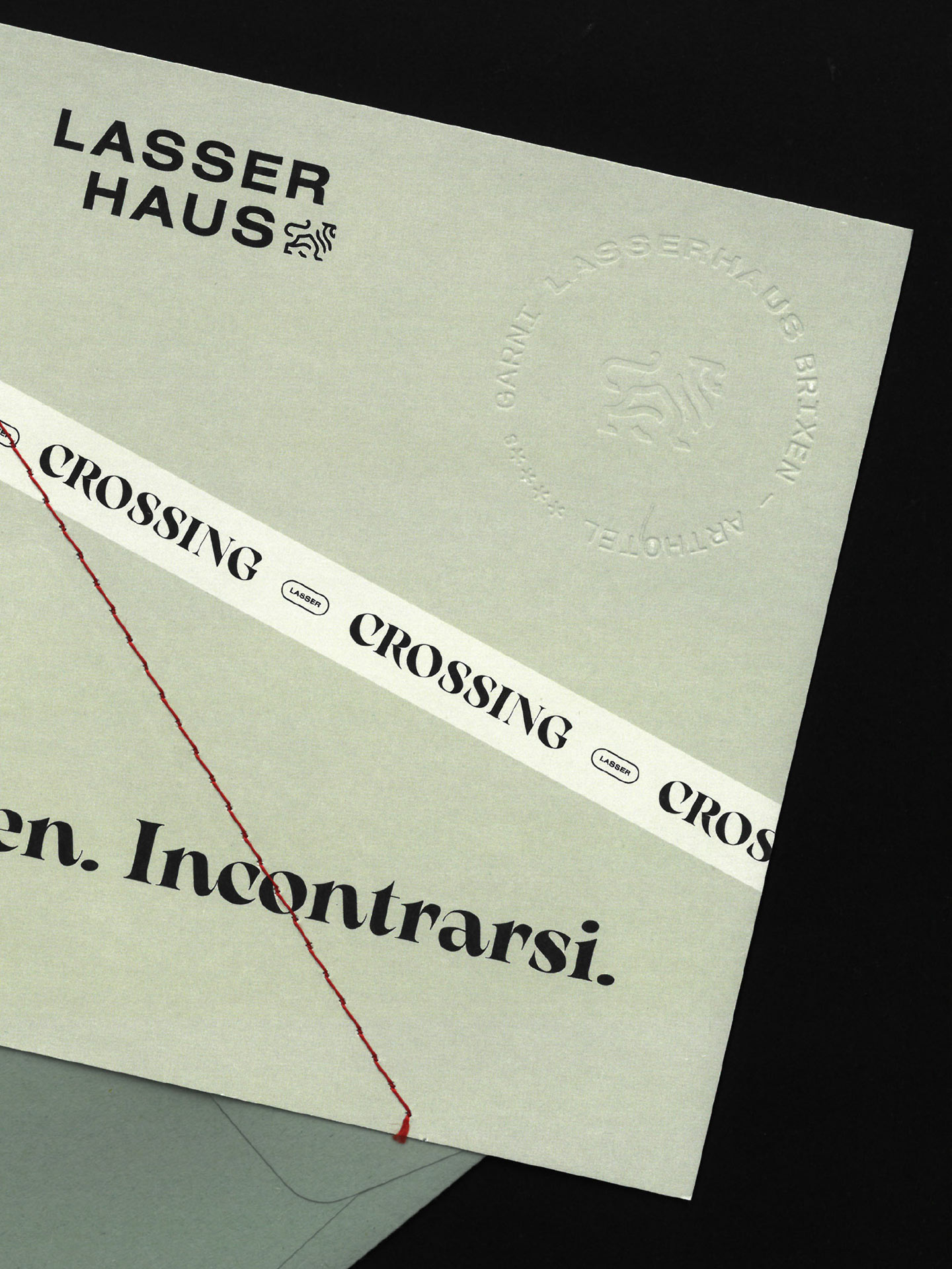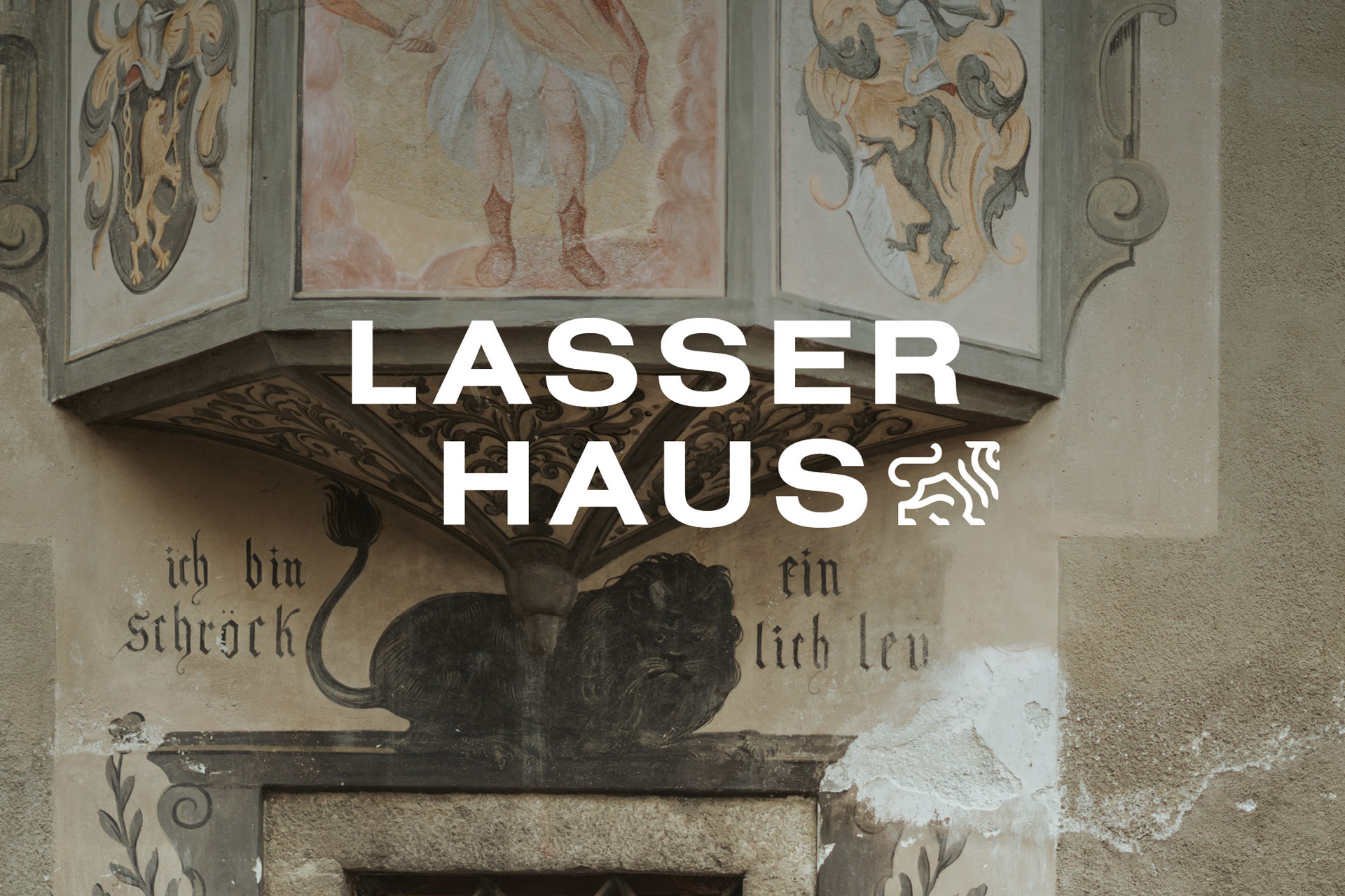
Our design approach was guided directly by the house itself. A central motif was the fresco on the façade featuring the lion and the line “ich bin ein schröcklich Leu.” This image was taken up, reinterpreted, and paired with a modern serif typeface. In this way, a visual language emerged that draws on the historical richness of the house while giving it a new form.