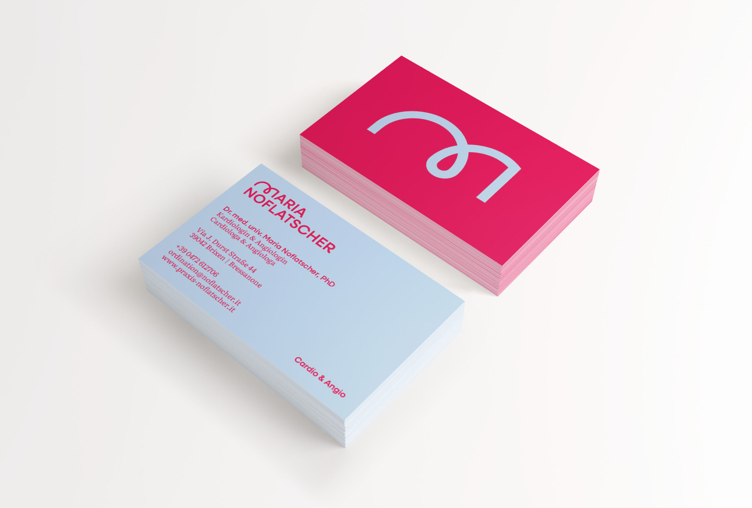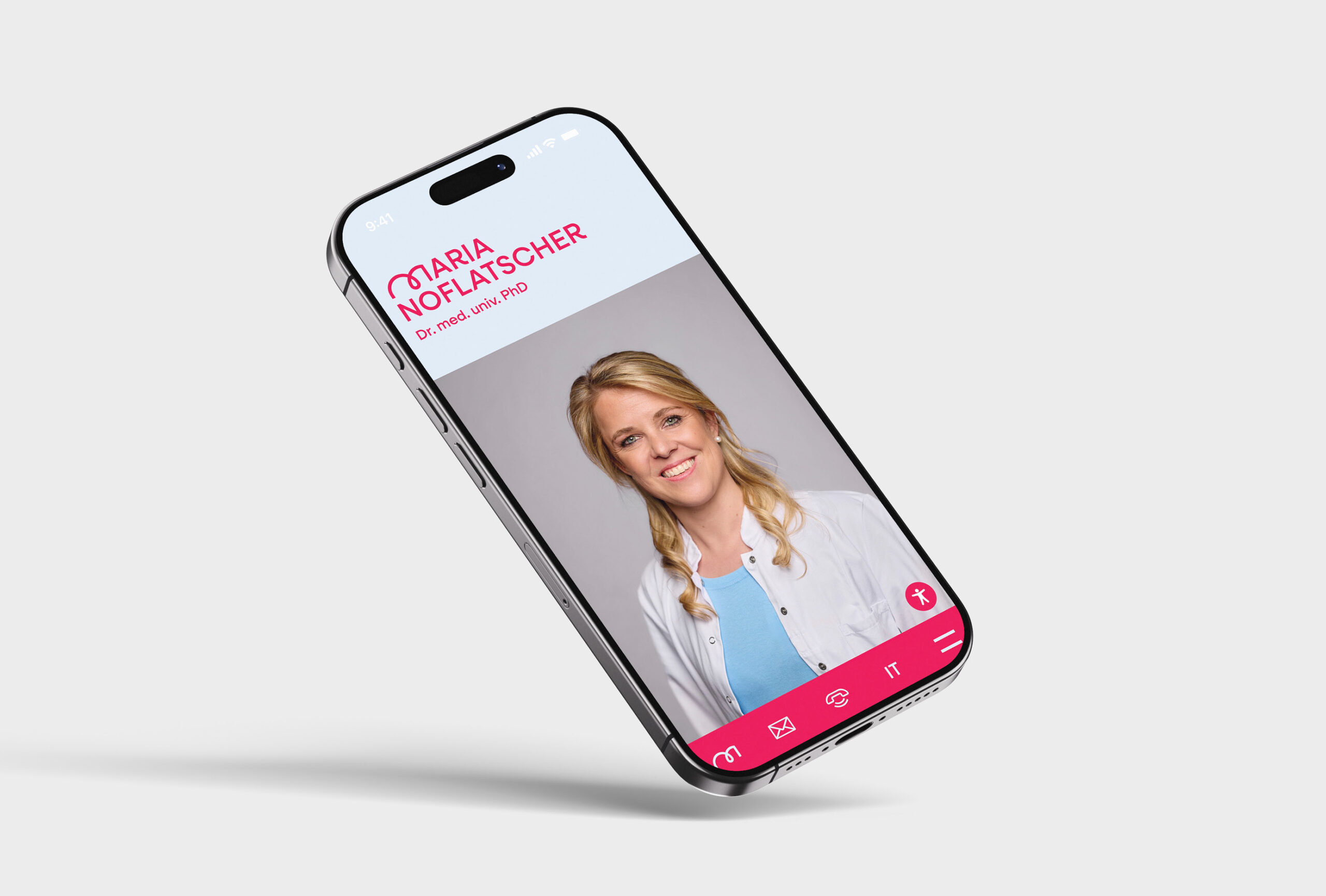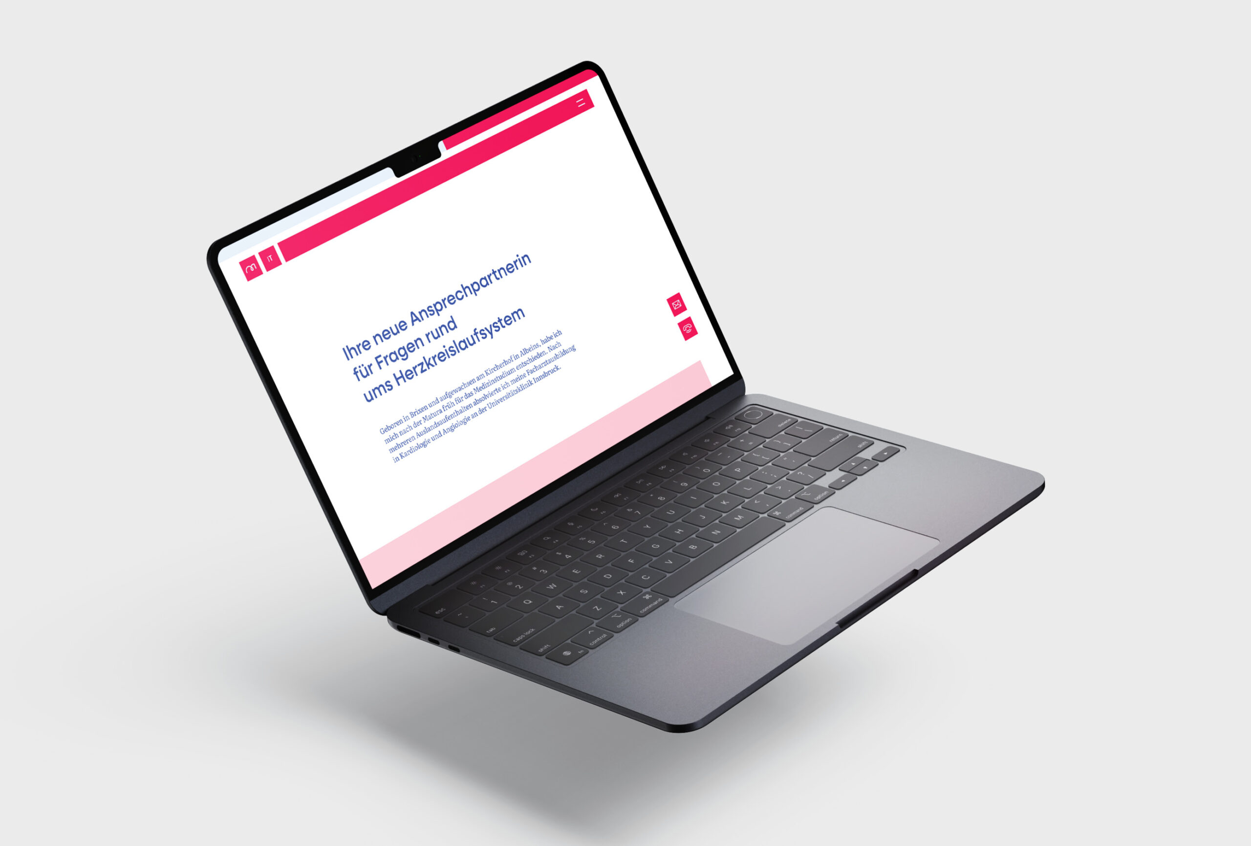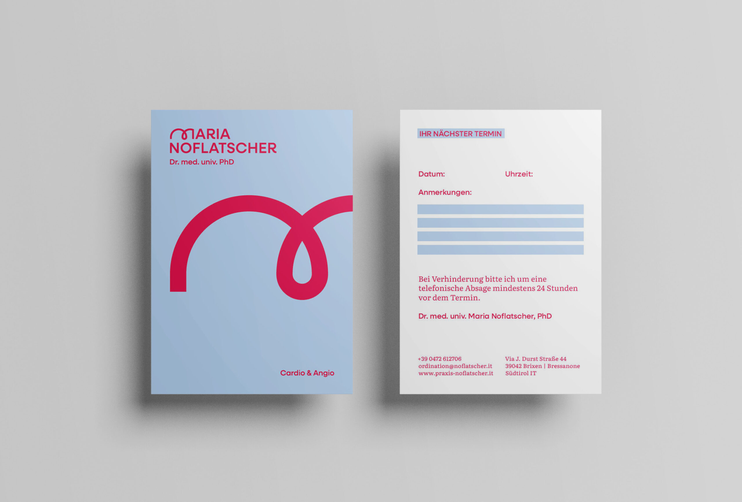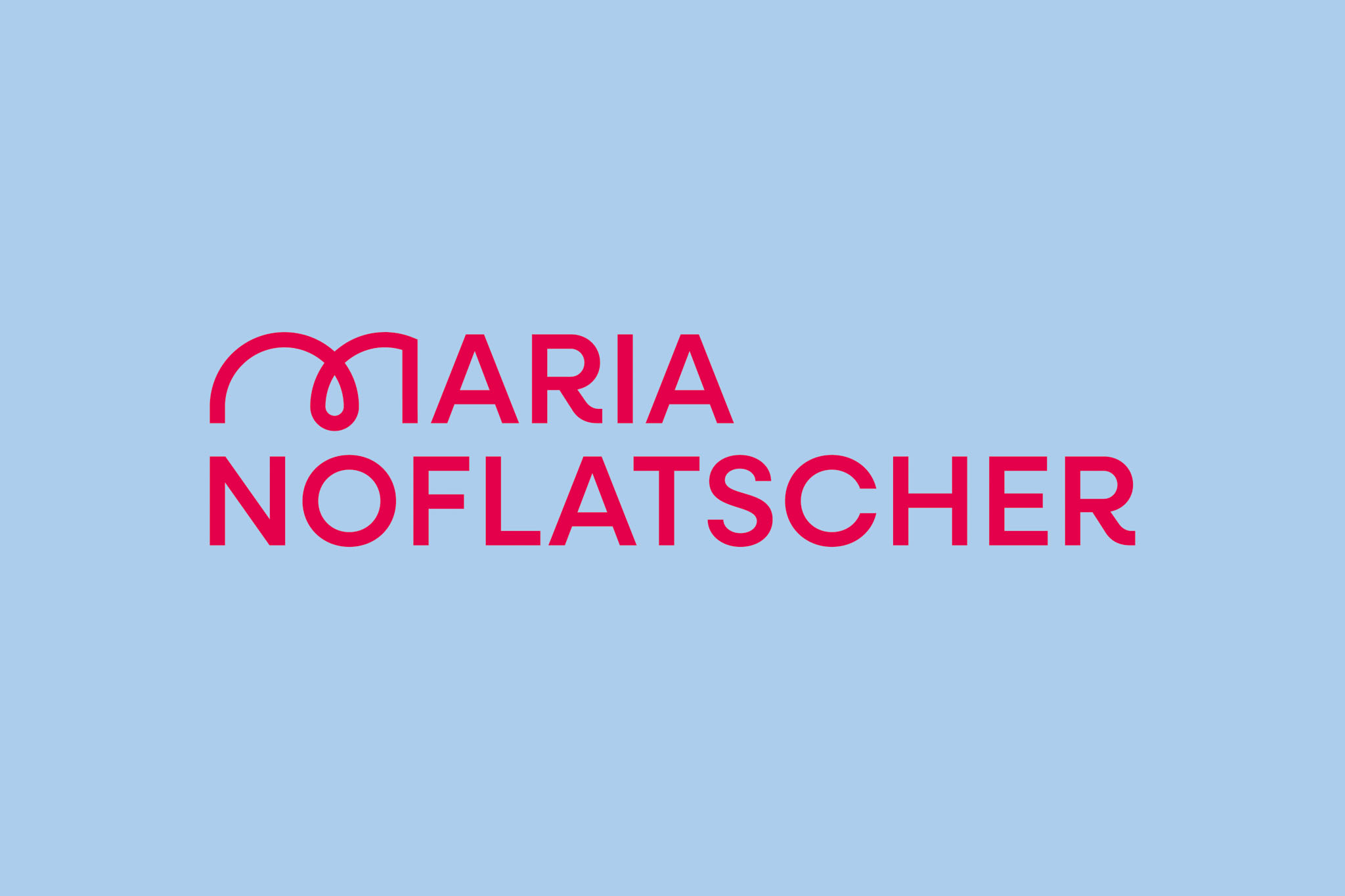
The specialization of the practice was translated into a reduced and precise visual form. The wordmark was refined in a way that allows it to be read on multiple levels: as a reference to the heart, as well as to vessels and angiological structures. The typographic design picks up this organic movement, combining medical clarity with a soft, flowing form.