Zum Inhalt Wechseln

Product Labels & Packaging Design

Product labels and packaging design carry a great deal of responsibility. They must hold their own in long aisles within seconds. A quick glance often decides whether something is understood or overlooked, whether a hand reaches out or keeps searching. Several layers often emerge in our thinking: Where is the product positioned? Top, bottom, center or somewhere on the edge? What is happening next to it? How loud or quite is the product? Does it linger in the mind, even when someone is actually looking for something else?

At Farmacia Dobbiaco, a broad product world had evolved over the years. Ointments, skincare products, supplements, all meaningful in their own right and born from specific need. A system developed that continues to grow steadily. As long as the products are familiar to someone, the sheer variety isn’t necessarily intimidating. It’s only from a distance that what’s missing becomes visible: cohesion.

The larger a range becomes, the less a single product can act as the sole point of orientation. It is the interplay that counts: Can you tell at a glance what you are reaching for? How do the products relate to one another? Are they just standing side by side, like two old acquaintances?

As long as the products are familiar to someone, the sheer variety isn’t necessarily intimidating. It’s only from a distance that what’s missing becomes visible: cohesion.

The larger a range becomes, the less a single product can act as the sole point of orientation. It is the interplay that counts: Can you tell at a glance what you are reaching for? How do the products relate to one another? Are they just standing side by side, like two old acquaintances?

At FD Dolomites, this was exactly the starting point. We didn’t just ask how a single label should look, but how an evolved product world could bevome a legible whole again. Where are the natural connections that have previously only functioned implicitly? How can an order be developed from this that explains itself?

We wanted to avoid falling into clichès. In this case, reduction was not a question of style, but a form of discipline. Especially in a medical environment, design often leans toward coolness or feels overly ‘friendly’. We searched for a visual language that remains calm, yet precise and invites the consumer to reach for it.

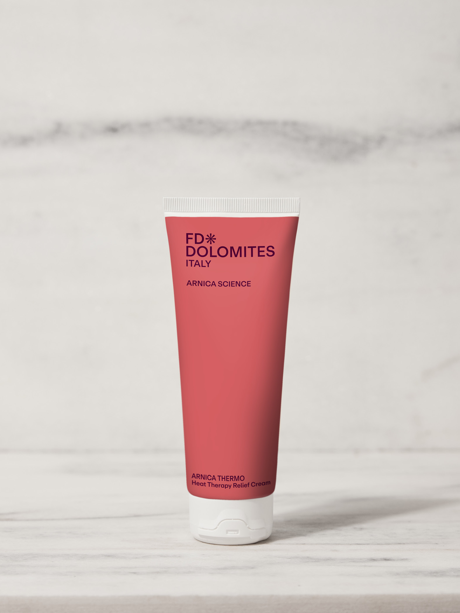
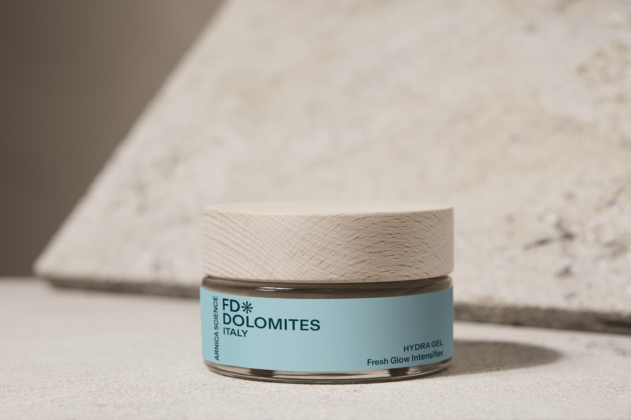
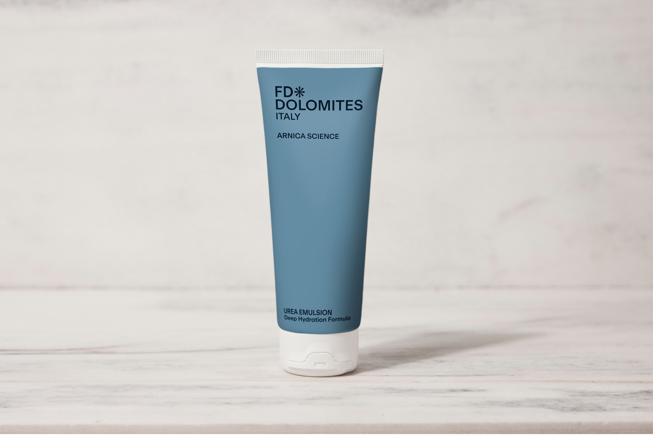
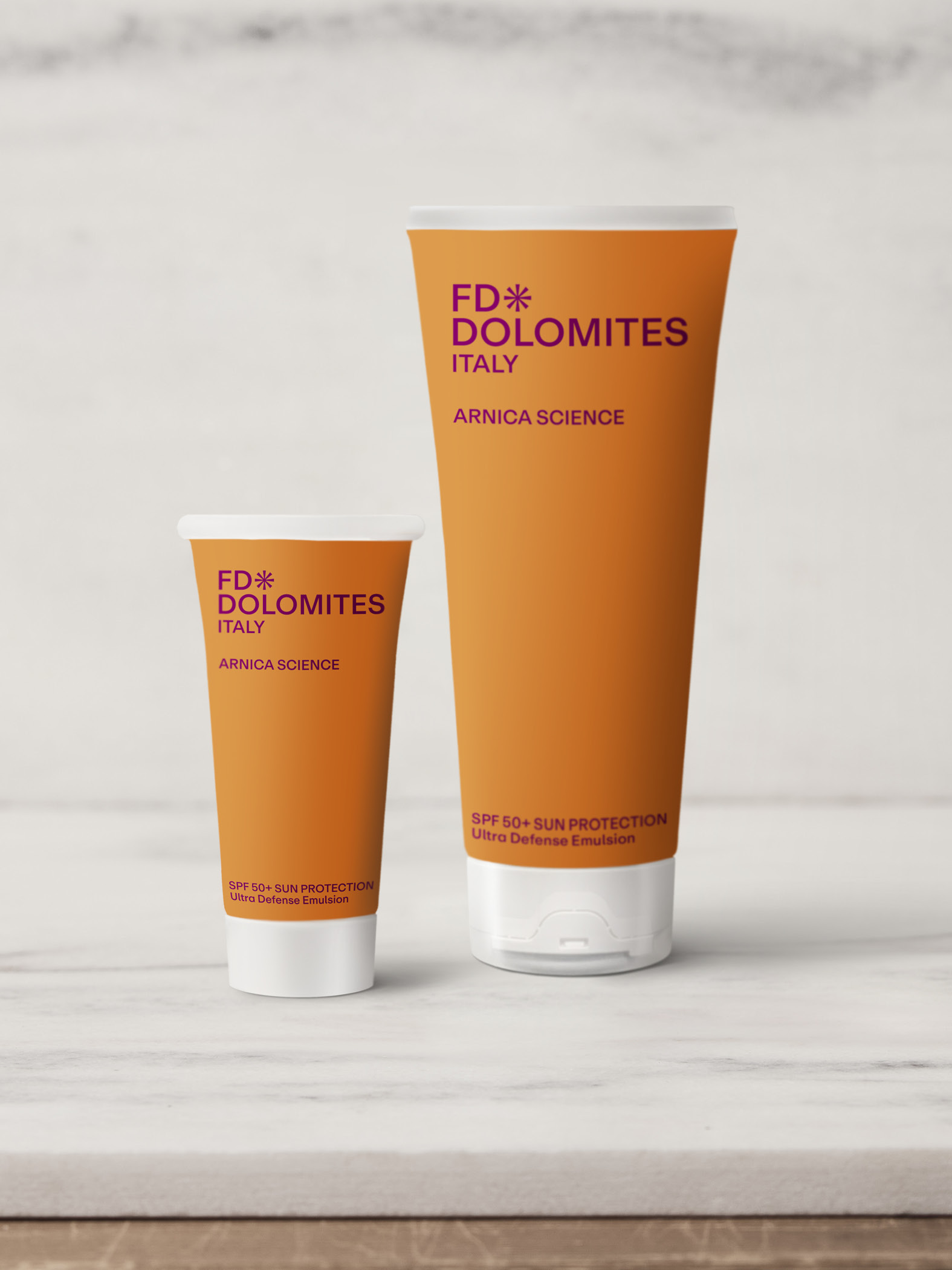
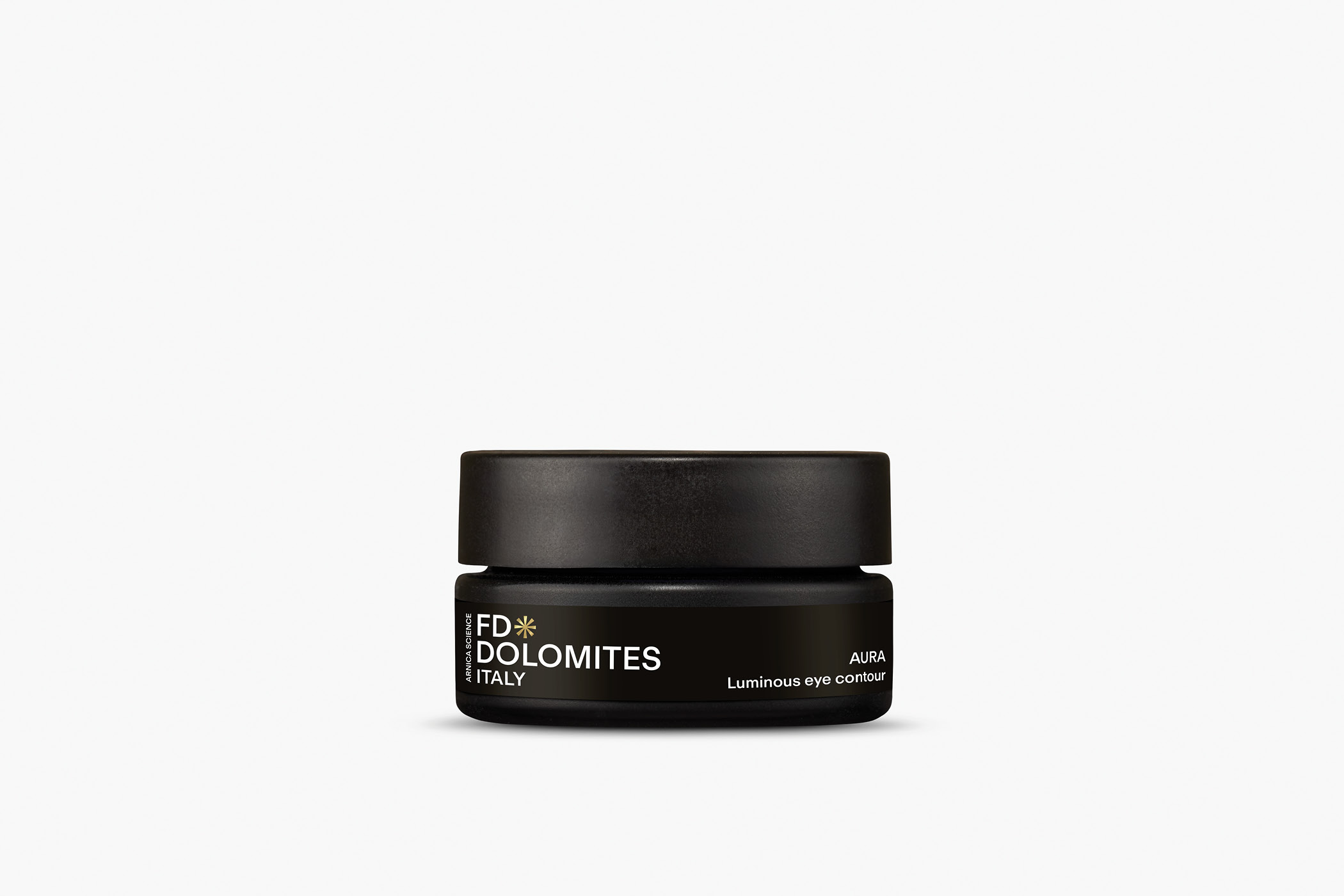
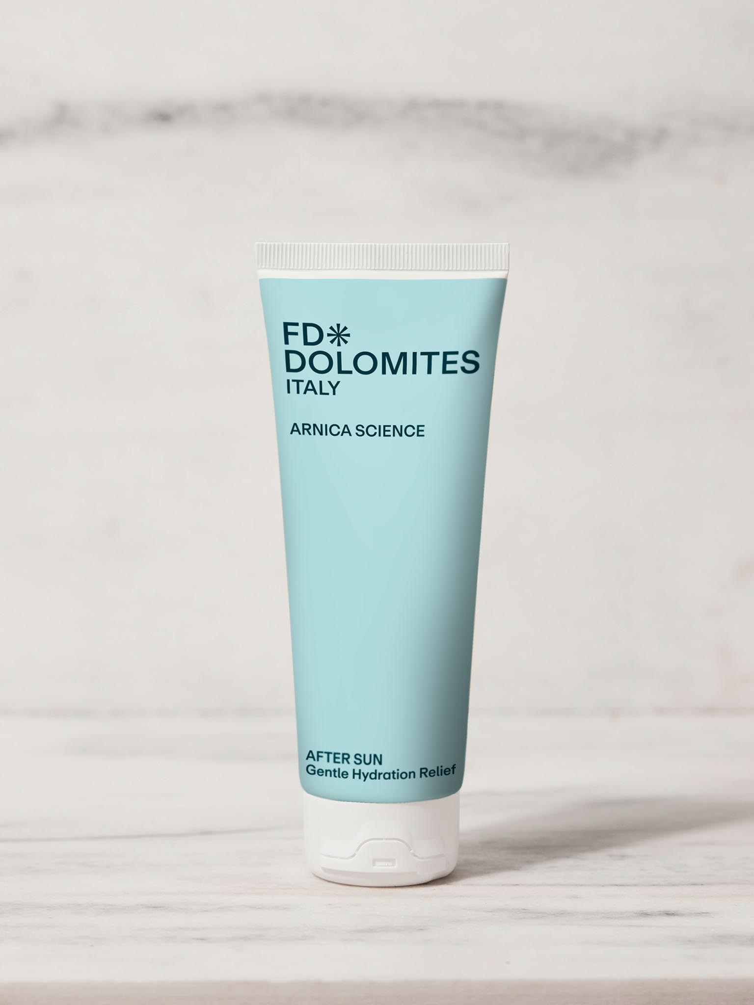
This is precisely where color functions as an organizing principle. It separates, connects, directs and relieves. Color systems act as reference points before language even enters the play. In a range with great breadth, color almost becomes its own form of navigation.

However, not everything needs to have the same tone. Within large product world, clusters always emerge, areas that require a different kind of weight or directness. Take the black Arnica line form the FD Dolomites, for example. This line sets an accent while remaining part of the bigger picture. Label and packaging systems must be able to grow; that is when design begins to be more than just a mere surface.

Kontakt SAY HELLO