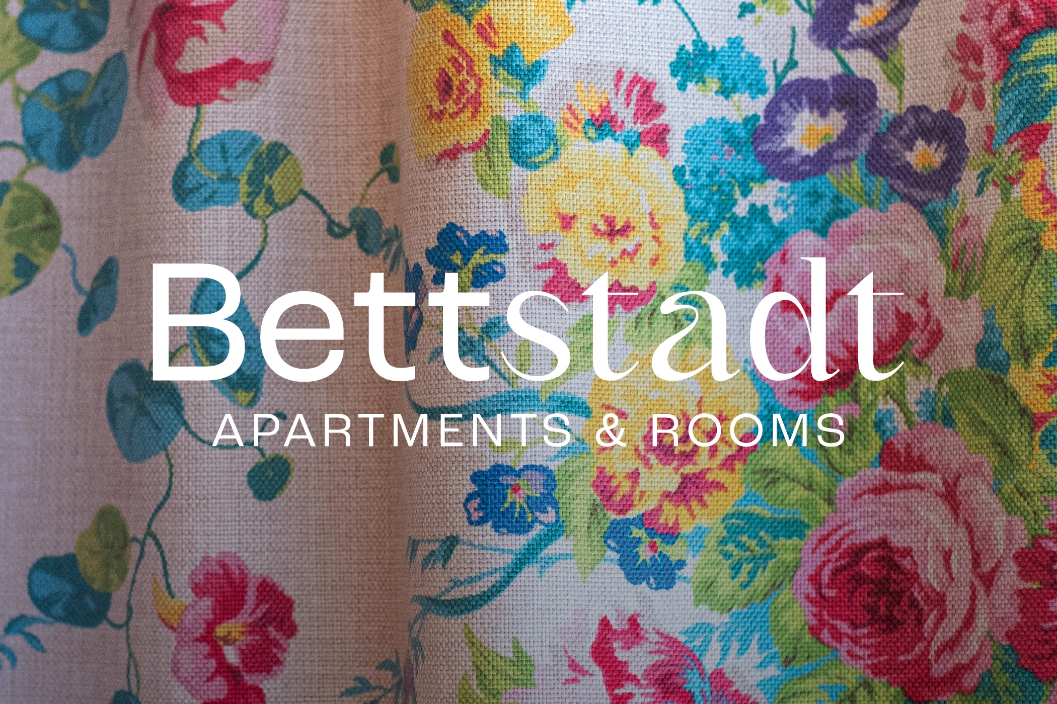
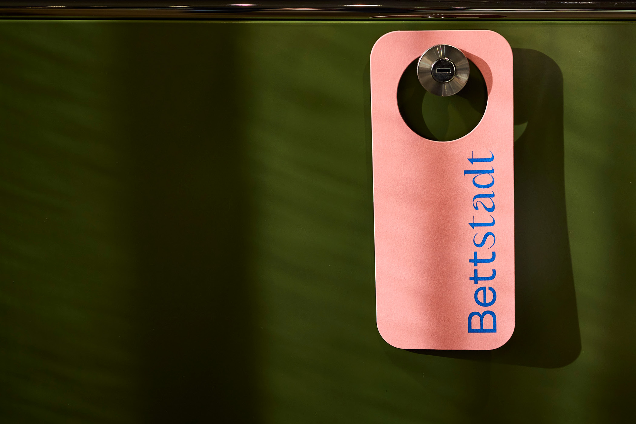
Bettstadt is a small, carefully run apartment hotel in the center of Sterzing. Its distinctive atmosphere grows out of a clear interest in art, architecture, and design — something that runs through the entire project and gives the house a character all its own.
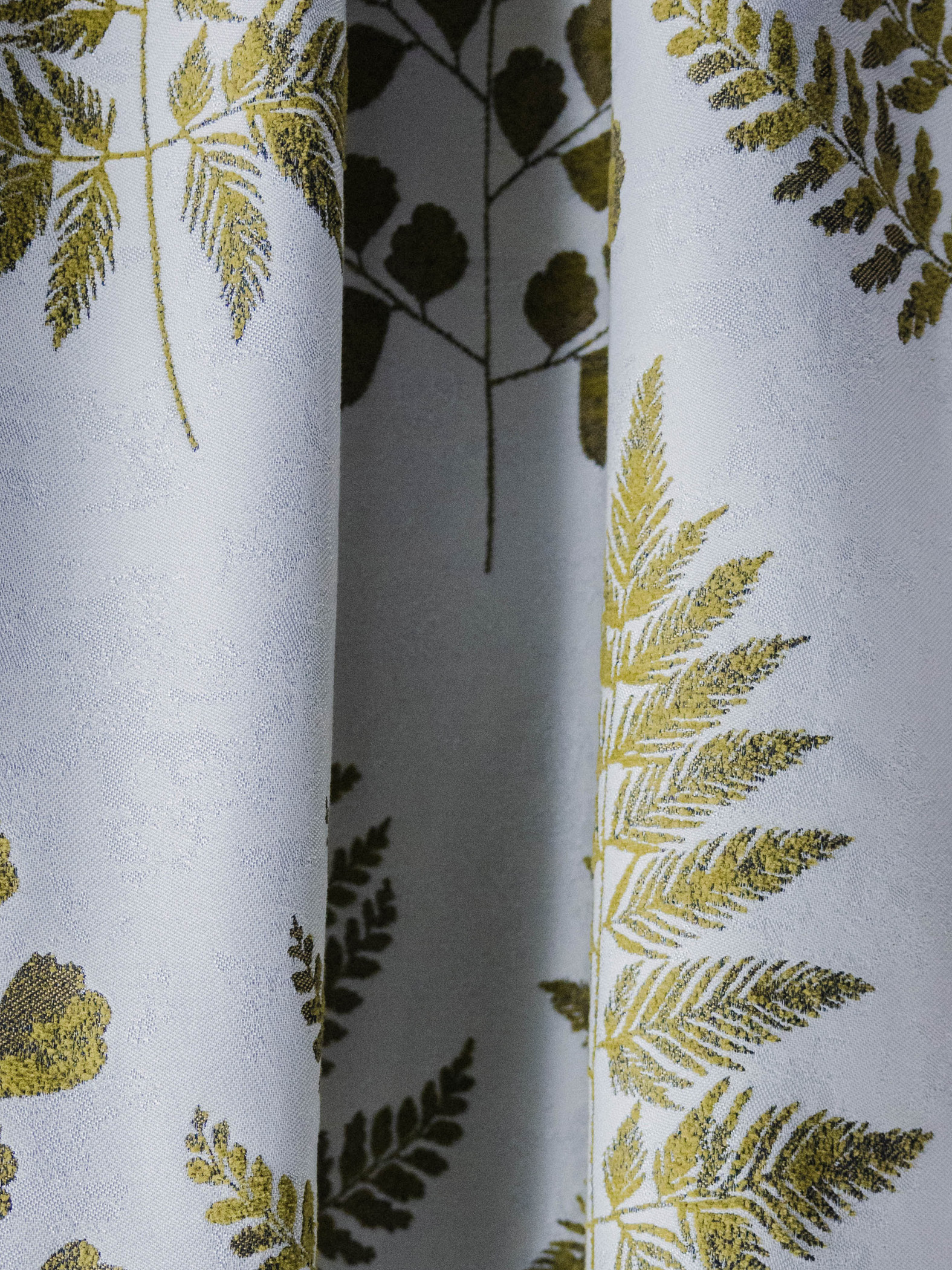
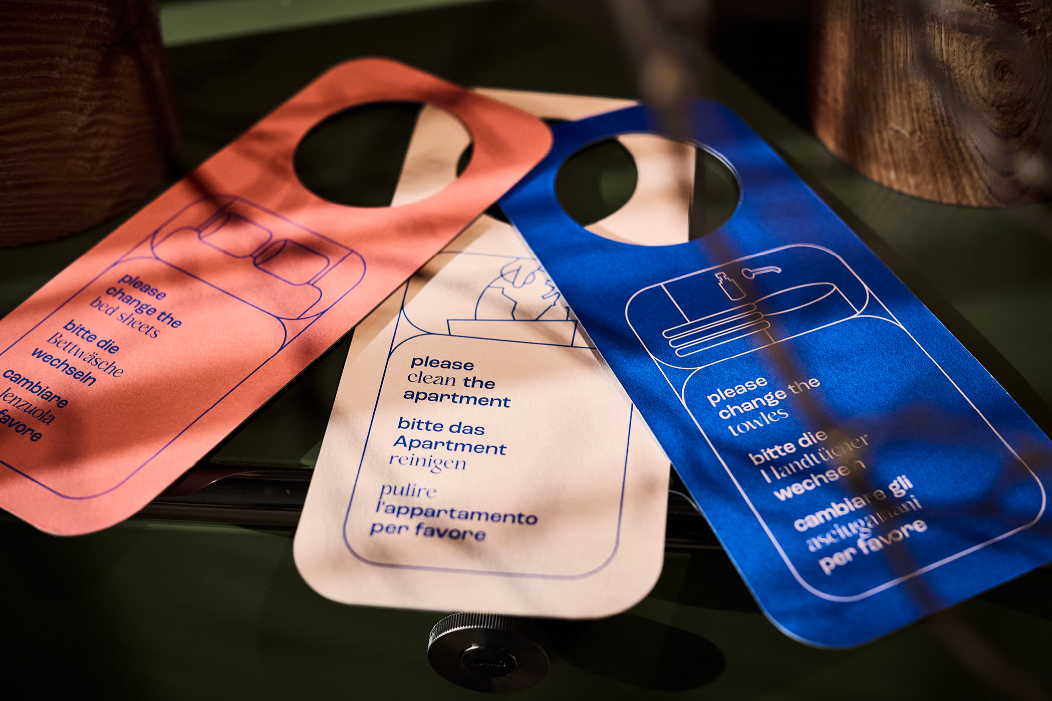
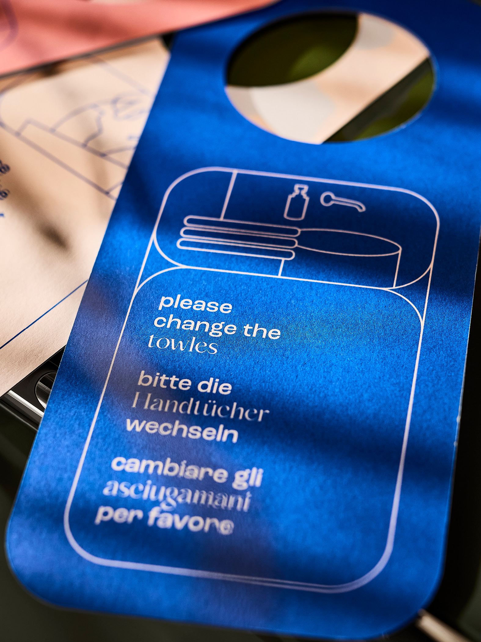
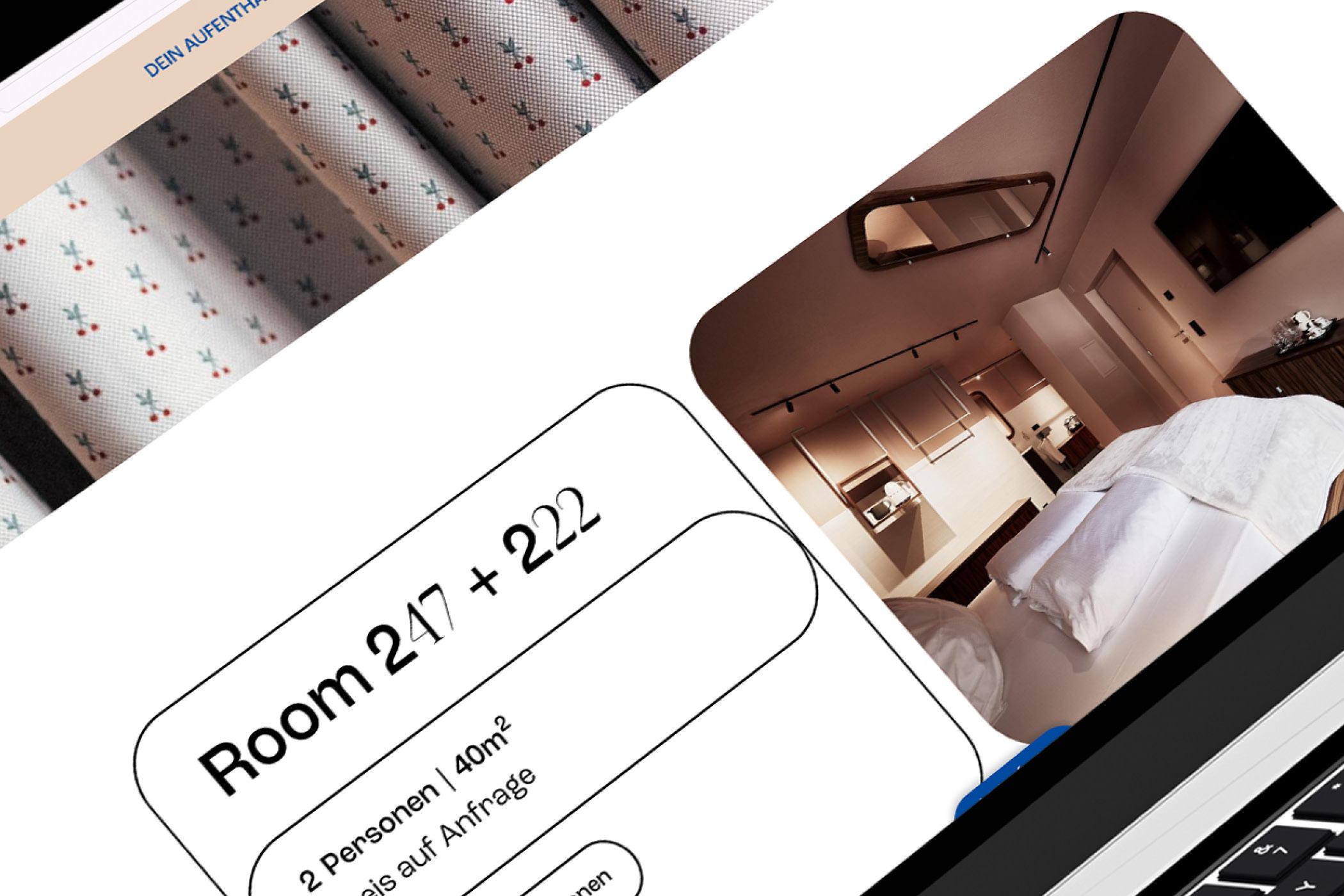
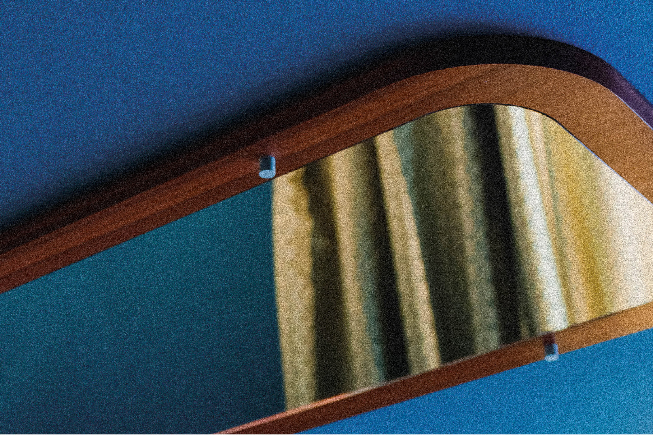
That strong sense of atmosphere made the starting point both exciting and demanding. Each room has its own color palette and its own character, which quickly made it clear that the visual communication had to connect directly to these elements. The goal was not a generic hotel identity, but a language developed from the house itself.


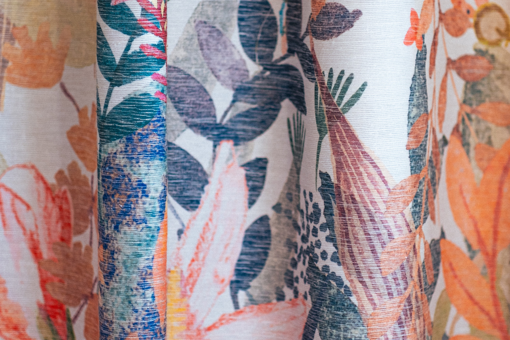
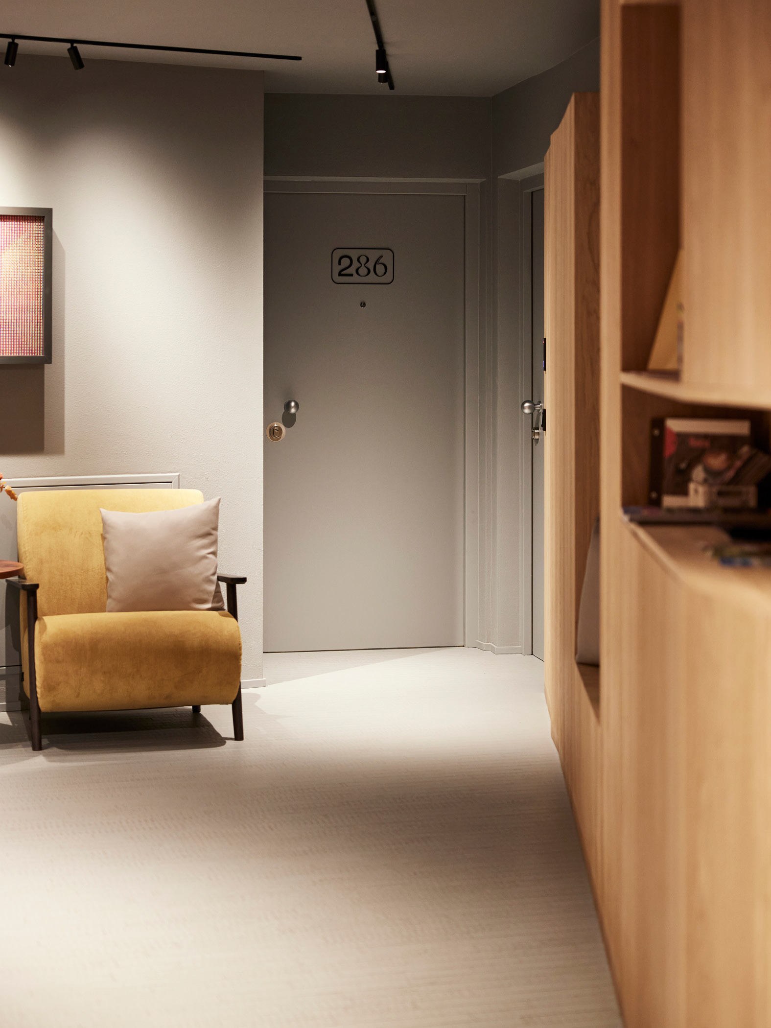
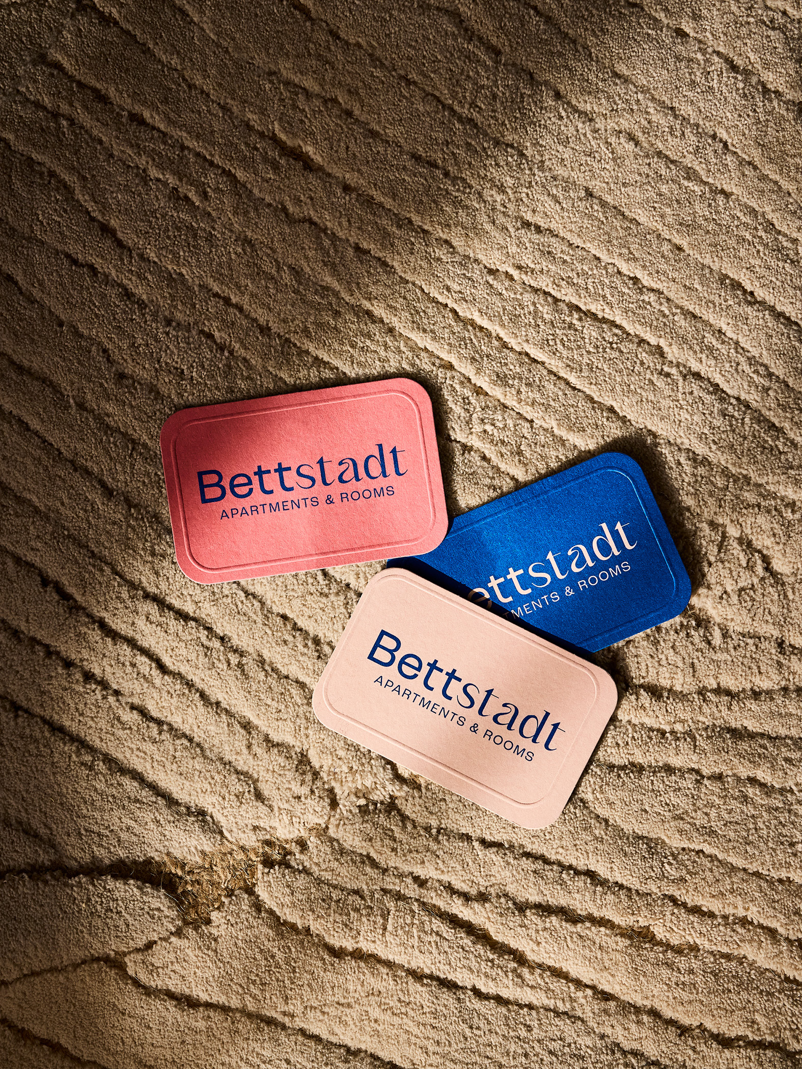
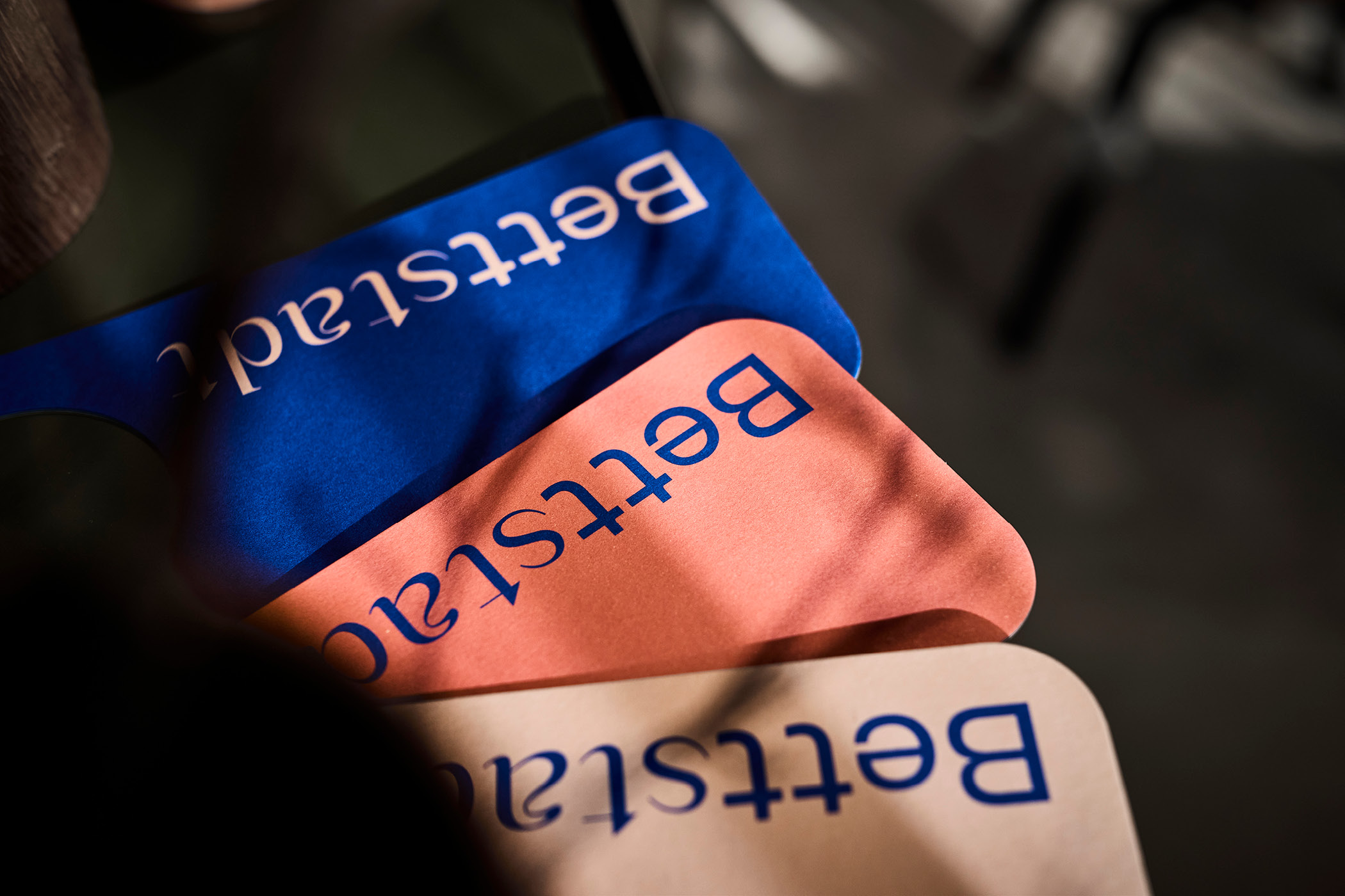
The design approach stayed closely tied to the architectural and chromatic elements of the building. The distinctive colors of the individual rooms were picked up and carried forward, allowing an identity to emerge that makes Bettstadt’s atmosphere visible while preserving the individuality of the house.
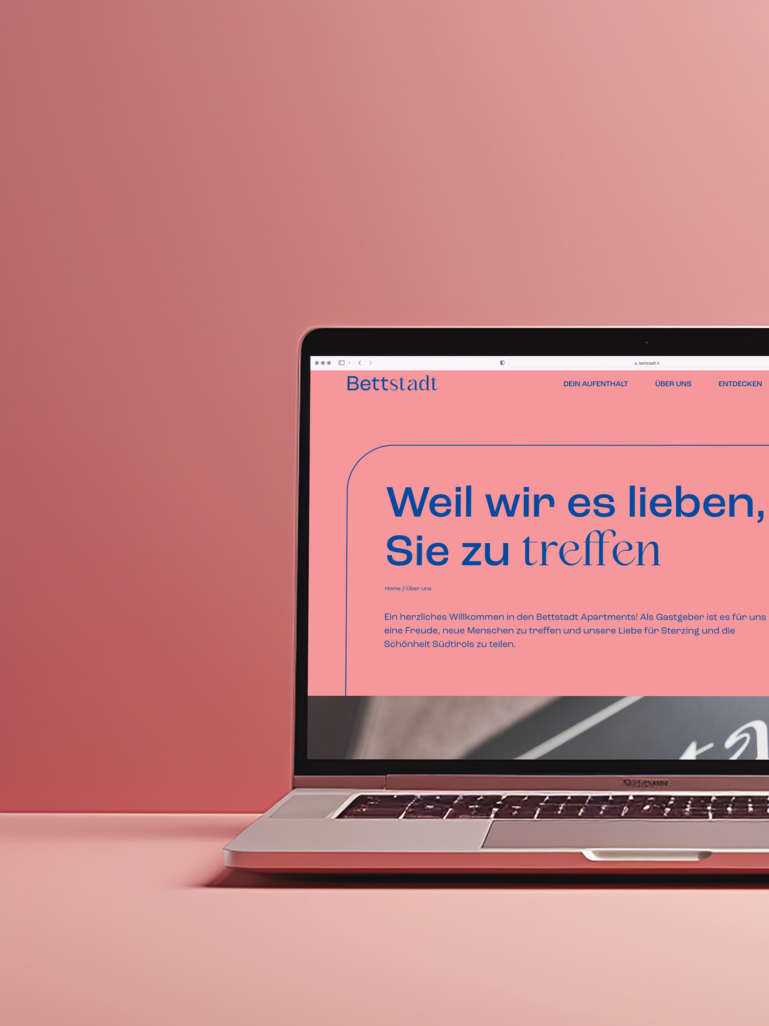
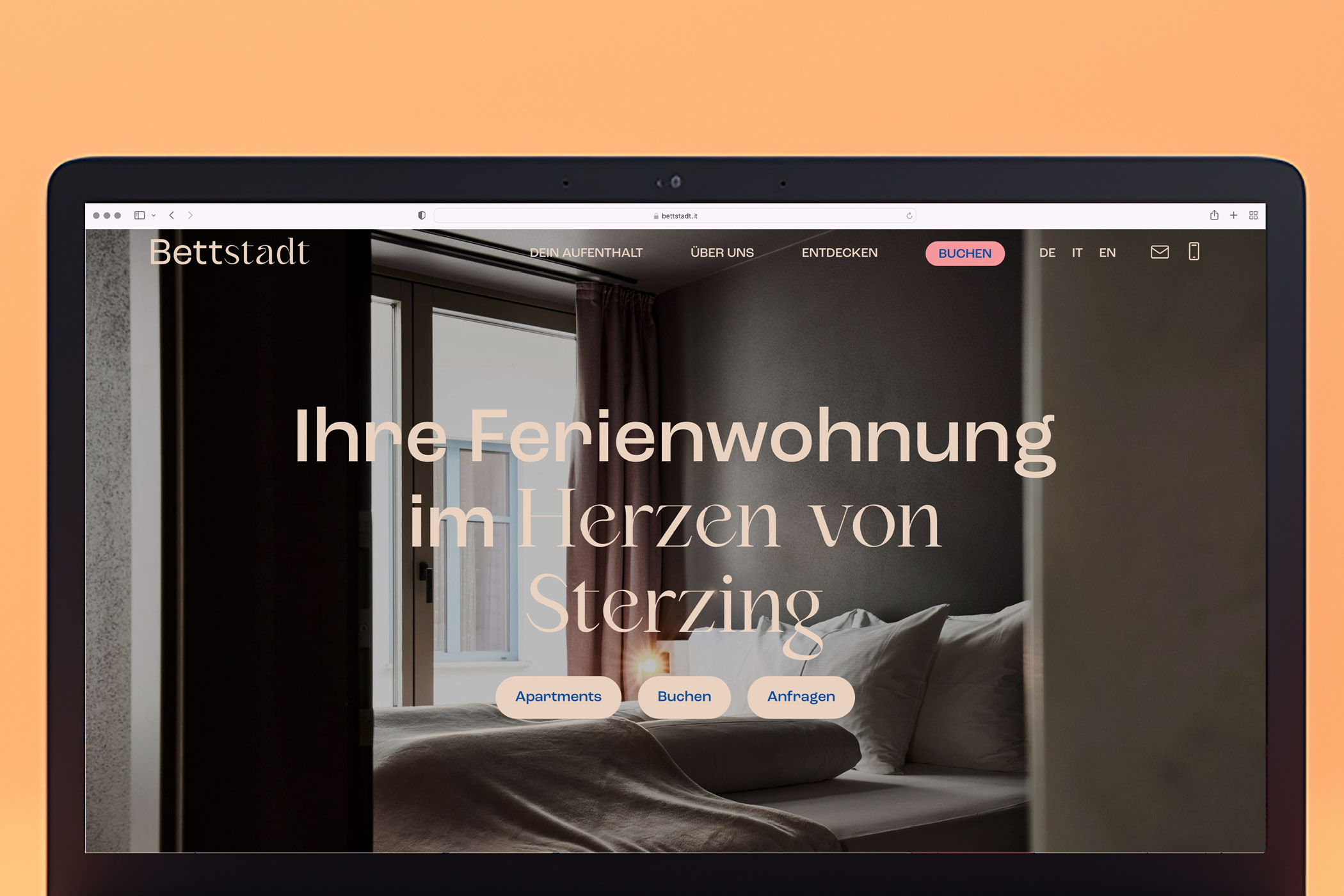
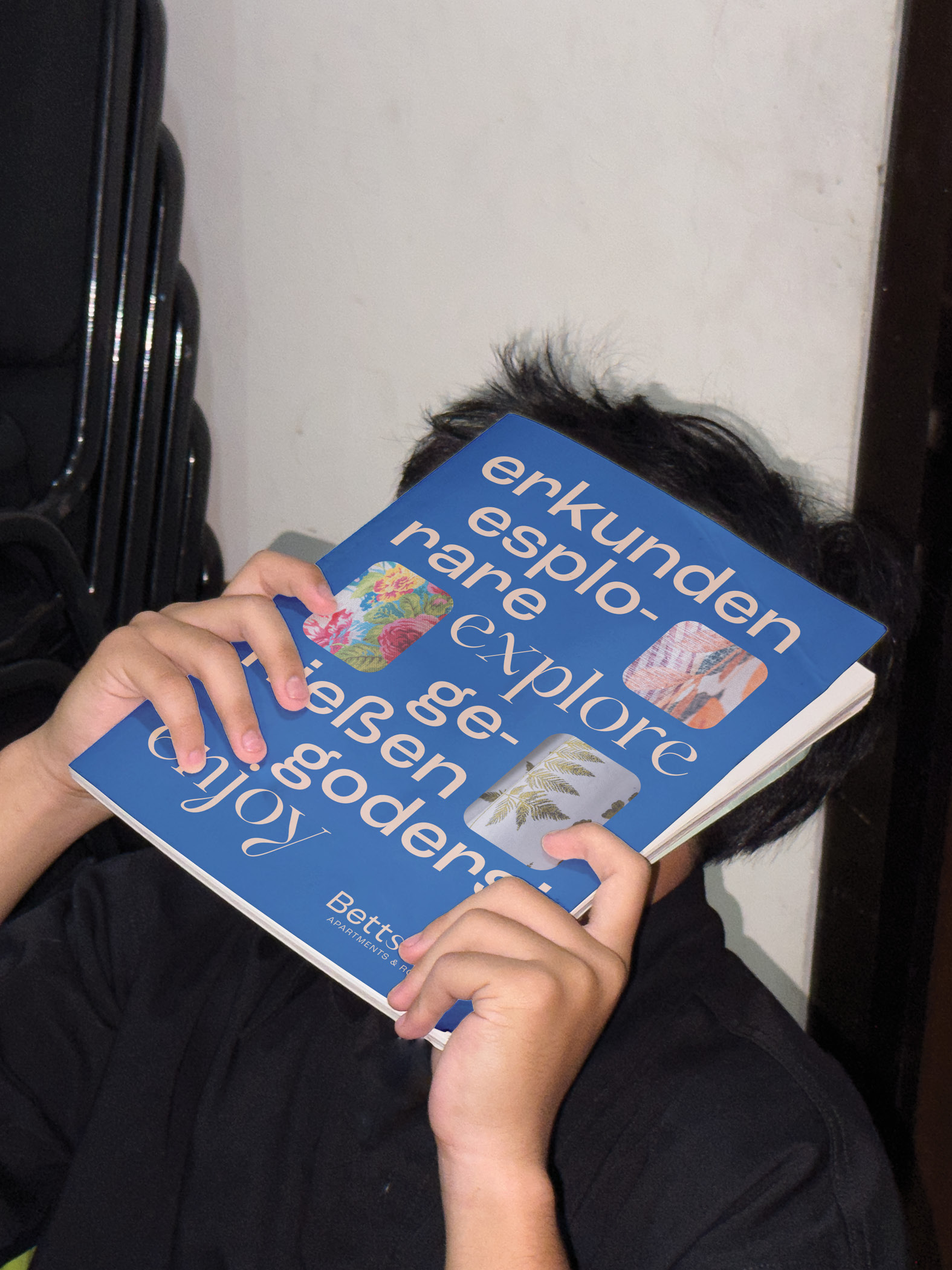
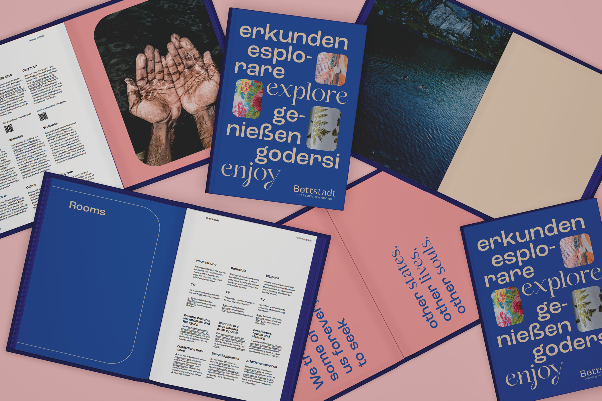

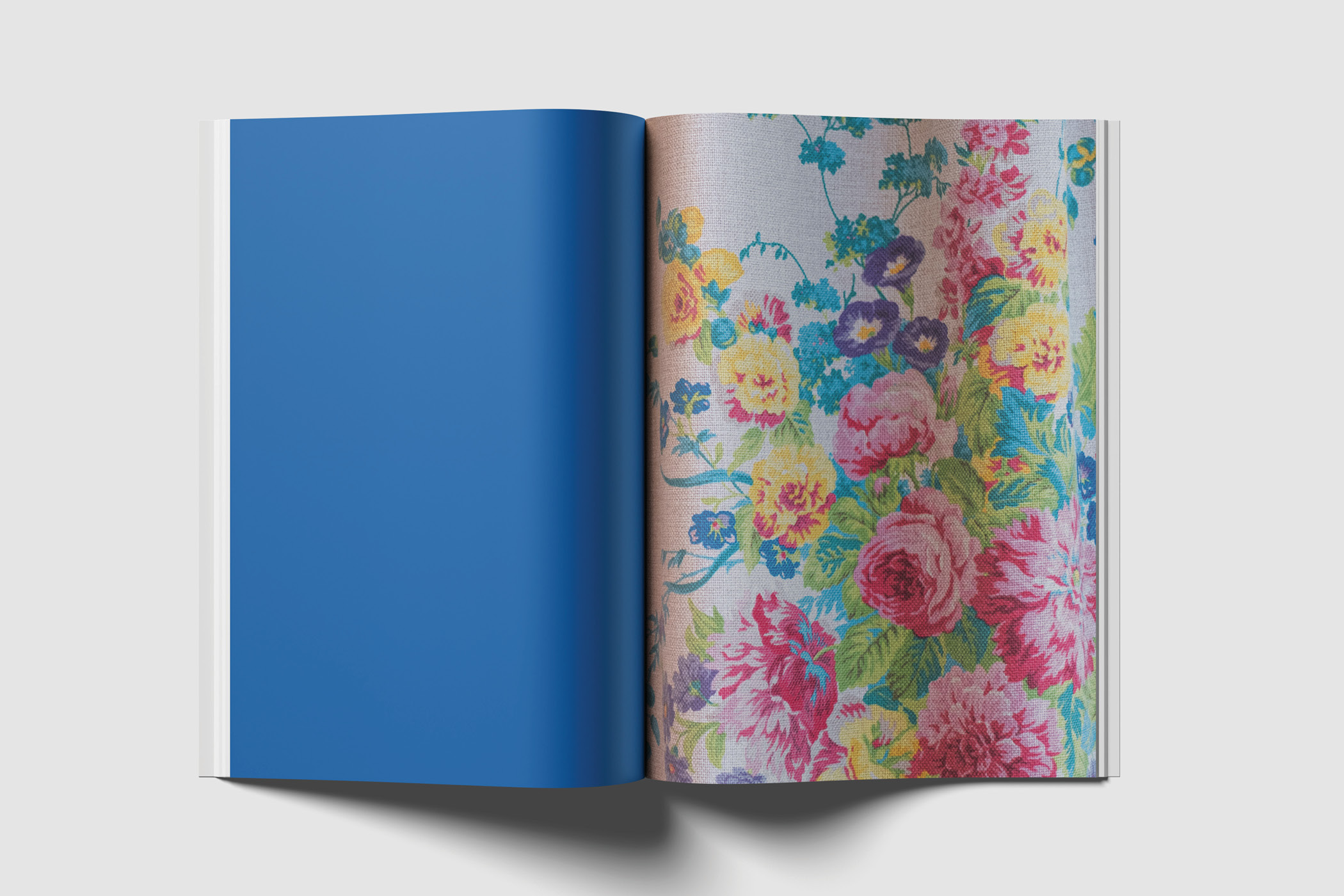
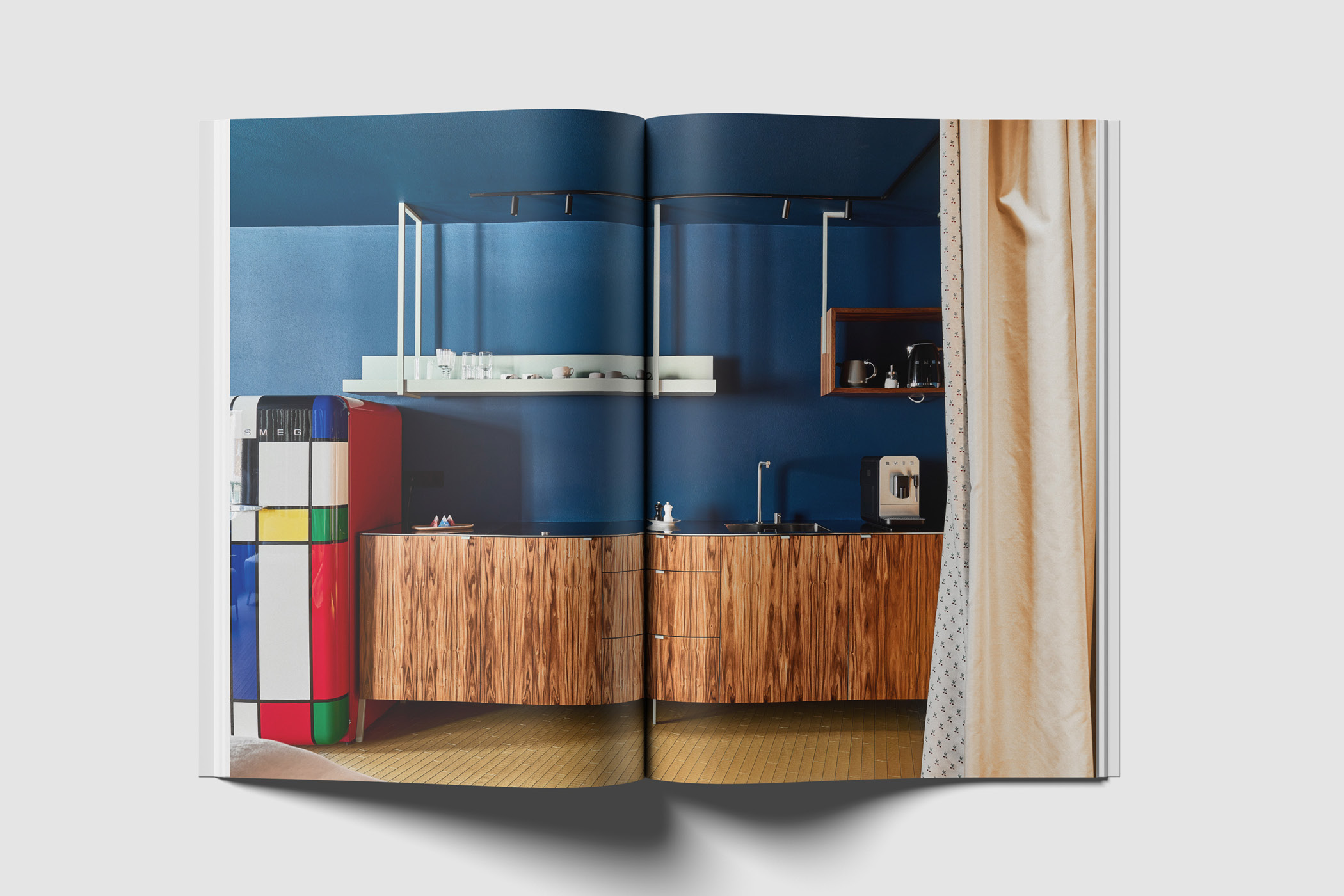
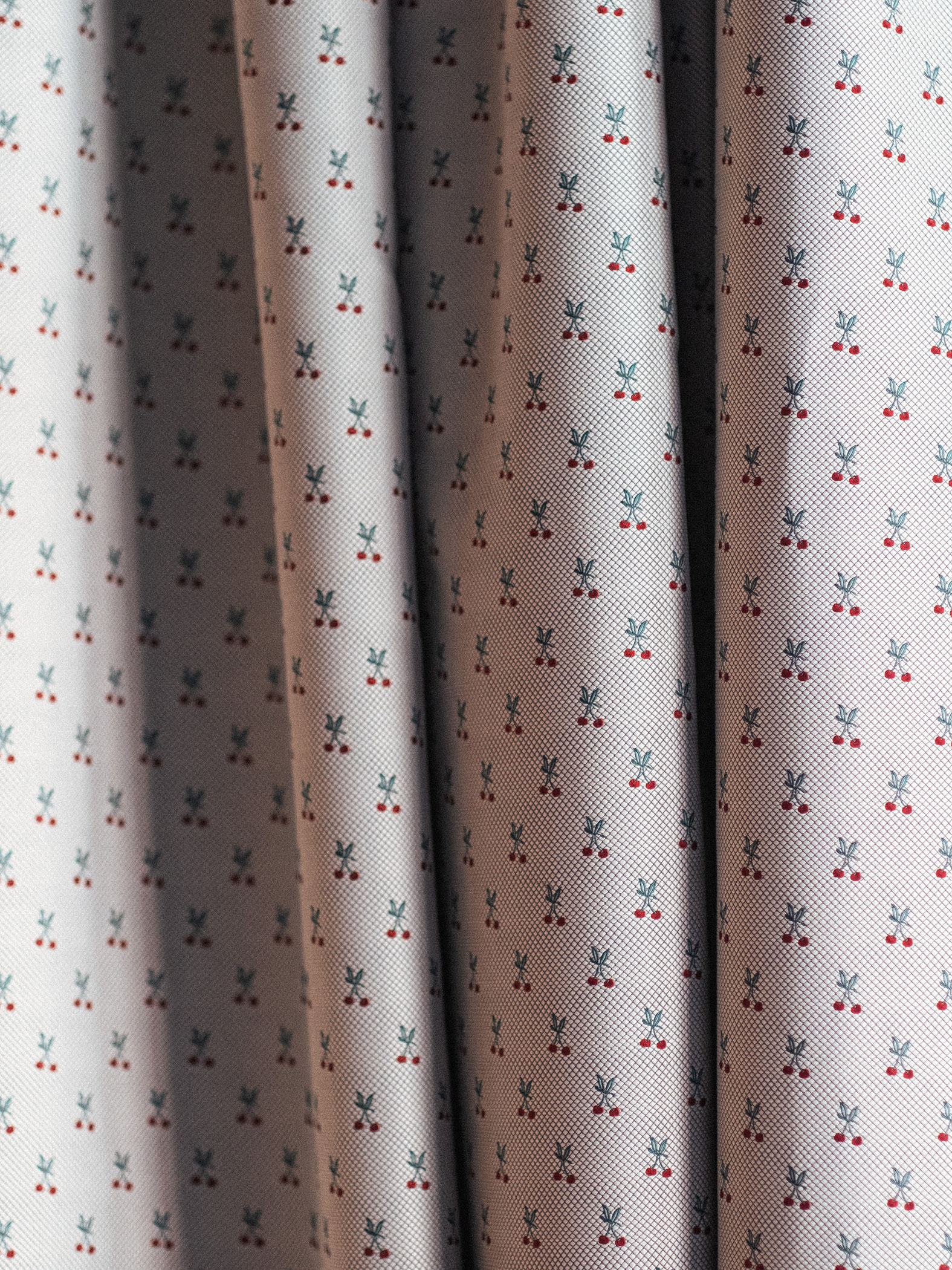
The final result is an identity that draws from the house’s distinct color world and translates it into a coherent visual language. Each room brings its own tone, and that same variety is reflected in the design. The striking typography adds another layer and gives Bettstadt a clear and unmistakable character.