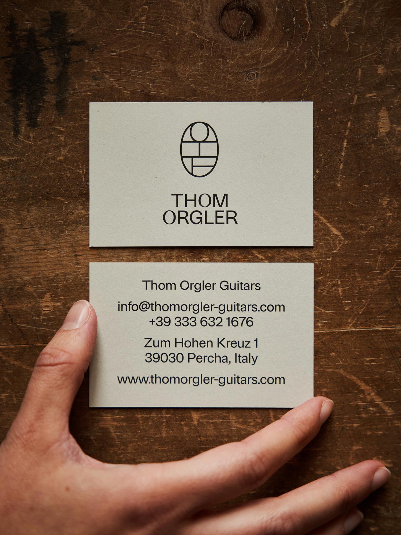
For years, the name Thomas Guitars had been a defining point of reference for handcrafted guitars. After the two partners went their separate ways, Thomas wanted to reposition himself both strategically and visually, including a new name.
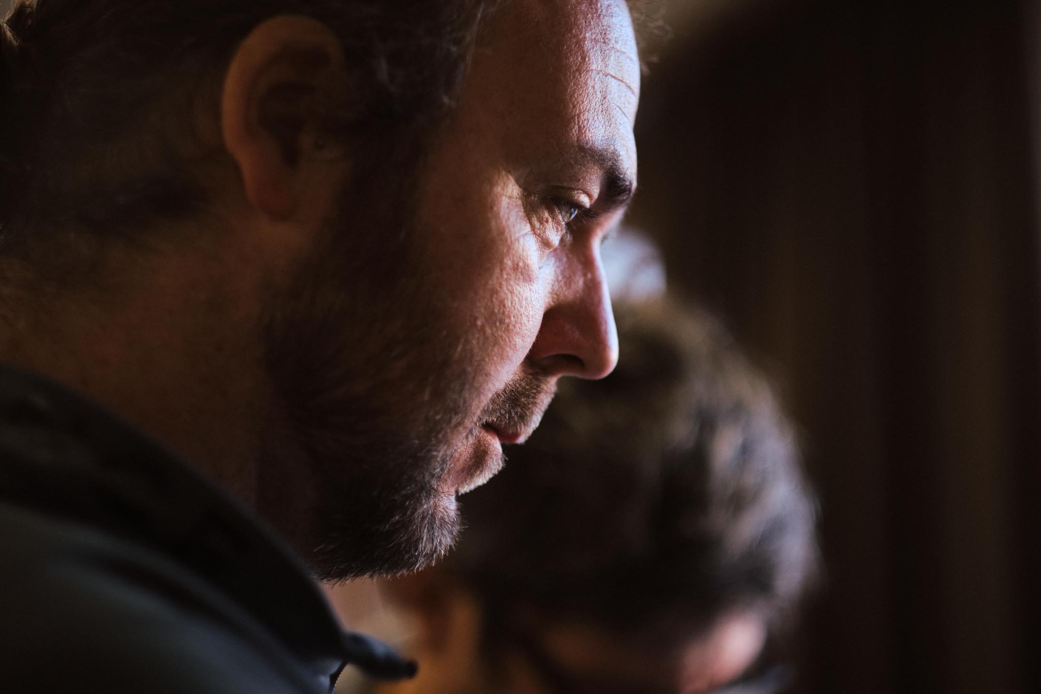
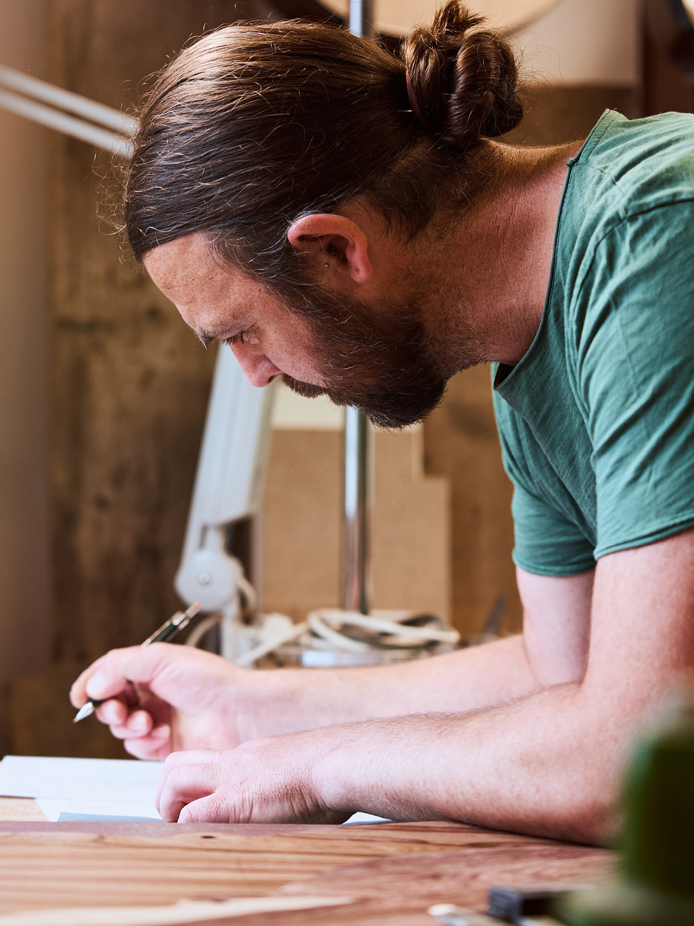
It is not the size of a company that matters, but the strength with which people work toward a shared direction. Together with Thom Orgler, we had the opportunity to support that journey from start to finish. Through naming, corporate design, a new website and photography & video, we created a visual stage for a new chapter.
For years, the name Thomas Guitars had been a defining point of reference for handcrafted guitars. After the two partners went their separate ways, Thomas wanted to reposition himself both strategically and visually, including a new name.

At the center was a fresh start that would feel true to Thom, both professionally and personally. The goal was to bring together craft, passion, and excellence in a direction that did not need explaining. At the same time, the framework needed to be able to grow along with new developments, new models, and increasing international attention.
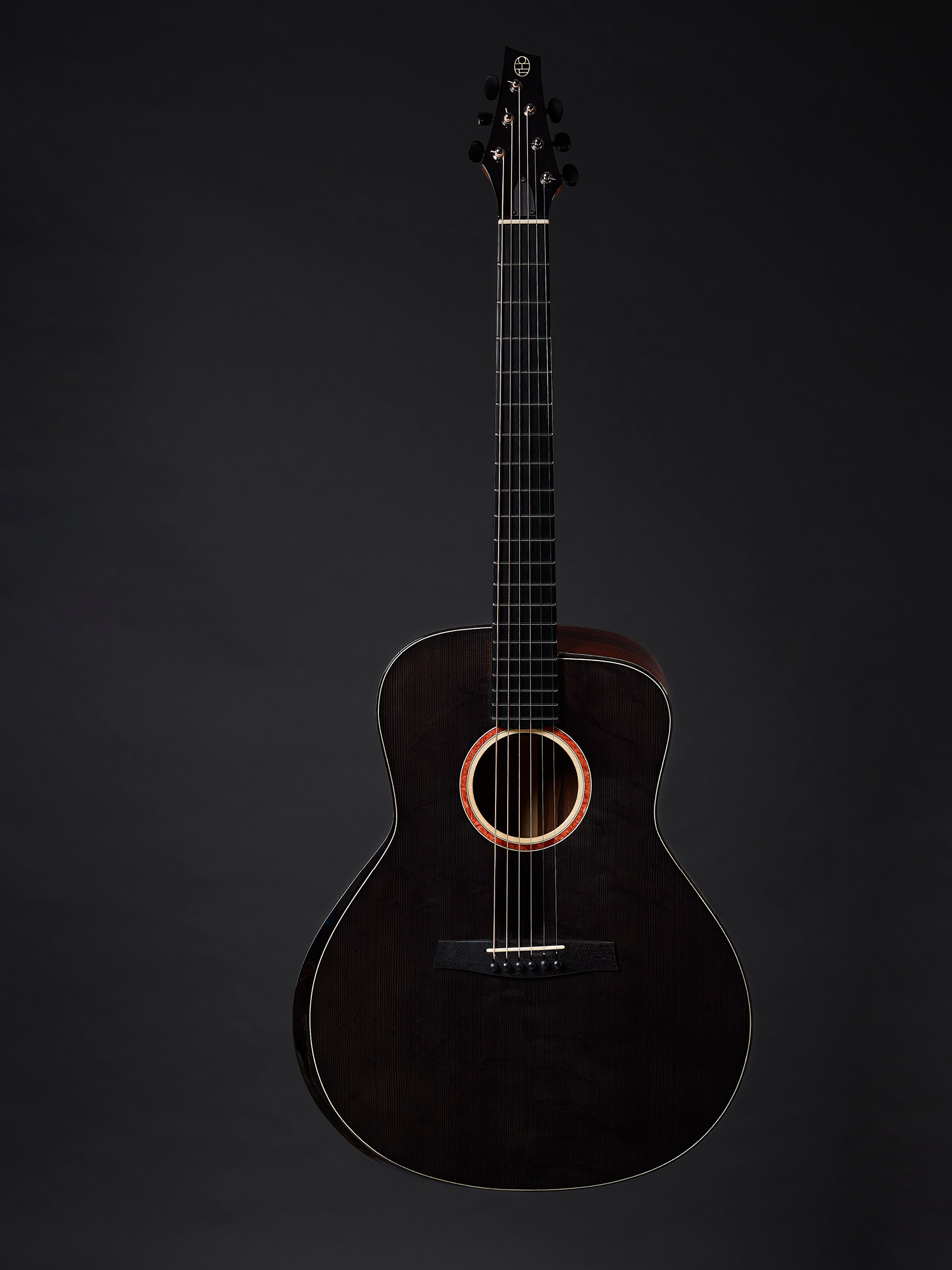


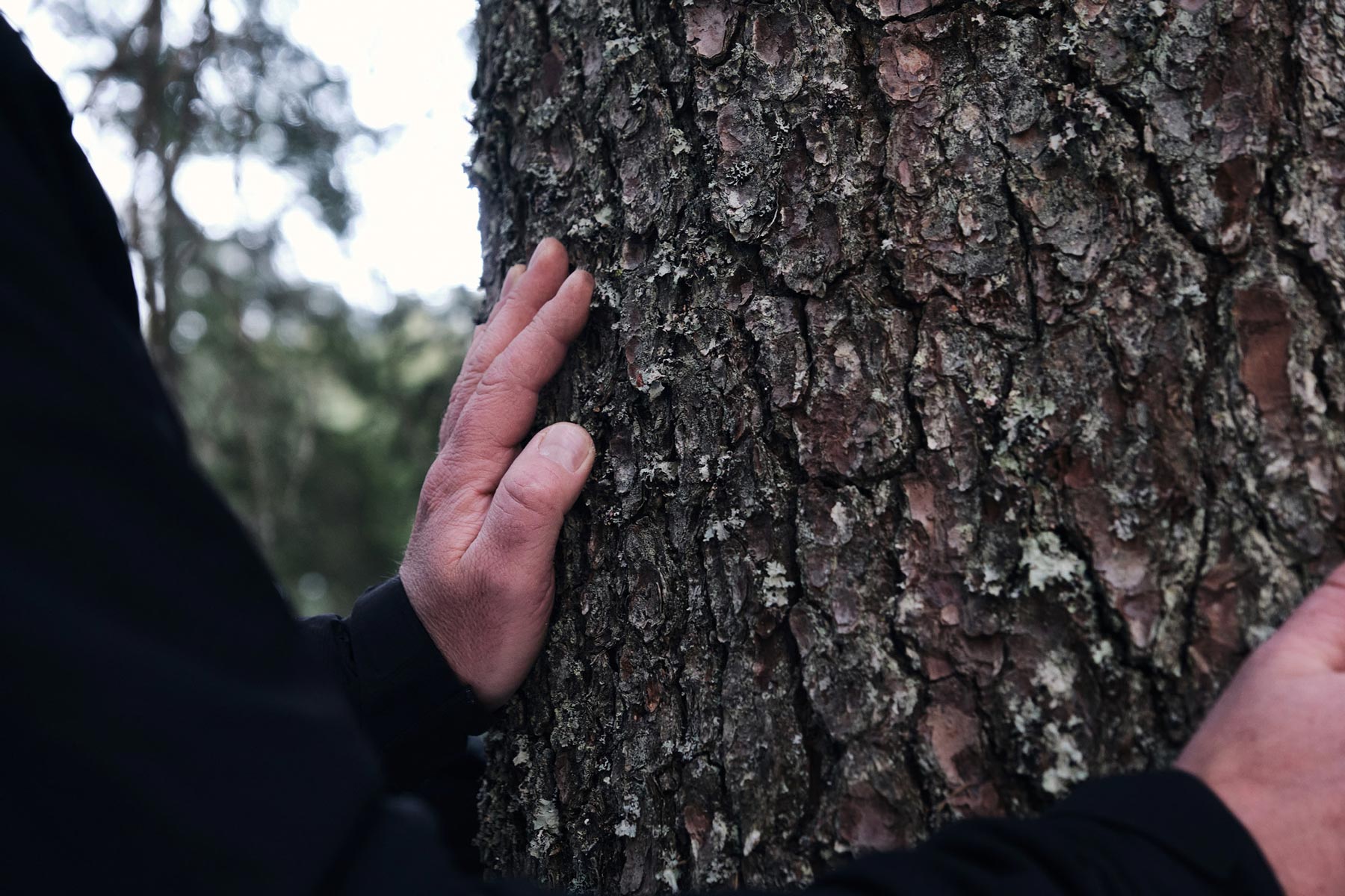
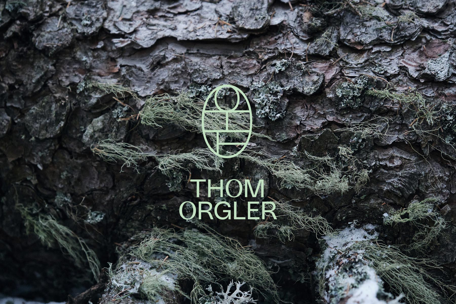
The new name sets the tone. A defined typographic language carries that character through all applications, while the color palette stays close to wood and nature, from moon spruce to the forests of Stradivari. The logo plays with a double reading, both as a friendly figure and, when rotated by ninety degrees, as initials. The project was rounded out by a video shot beneath the Latemar, accompanied musically by Manuel Randi.